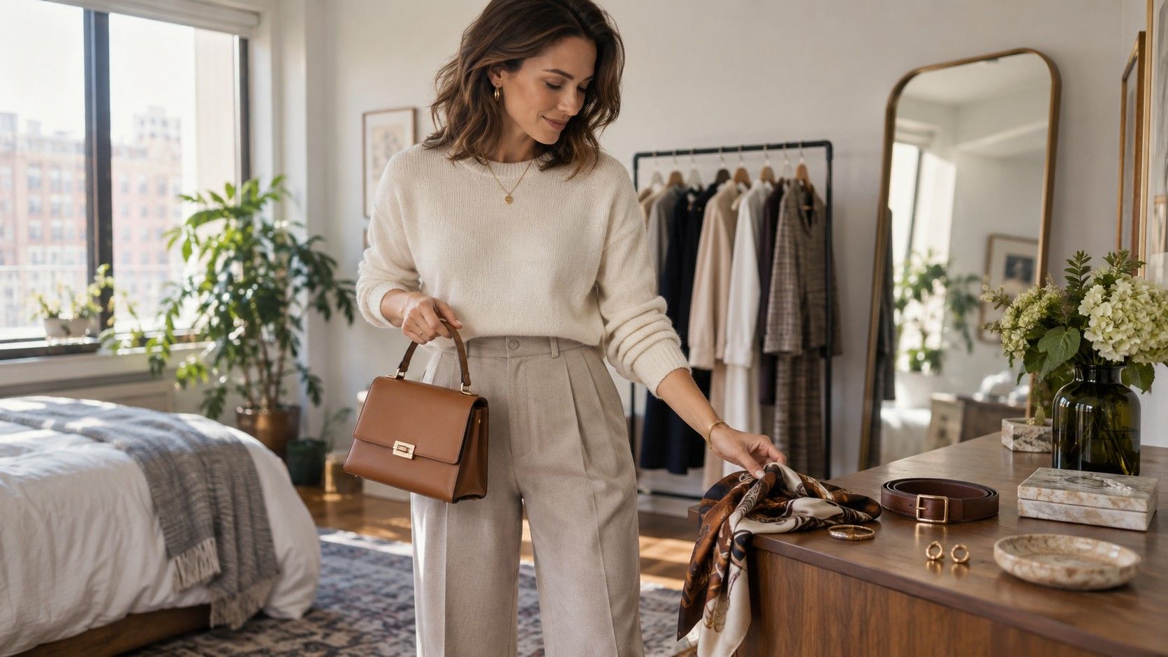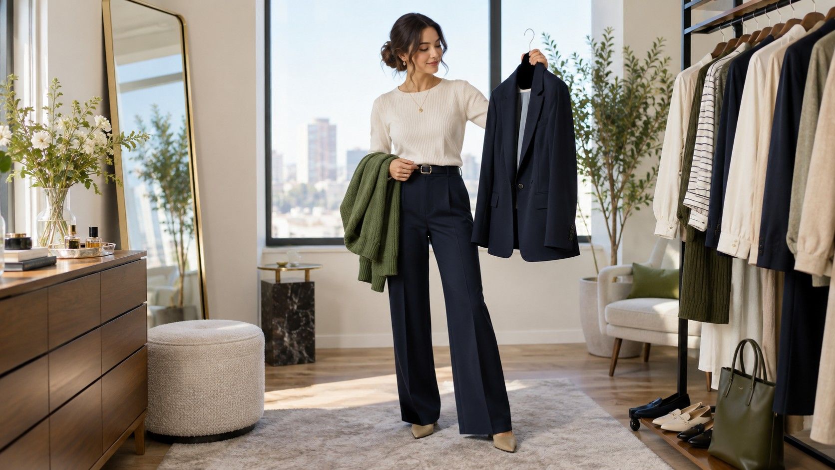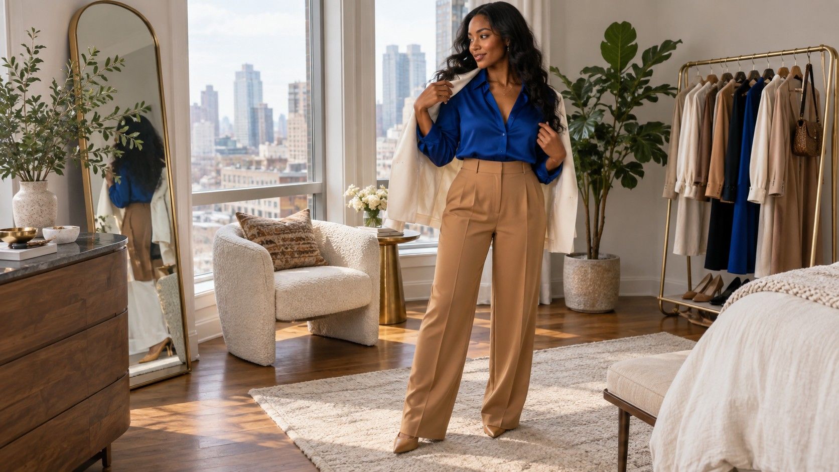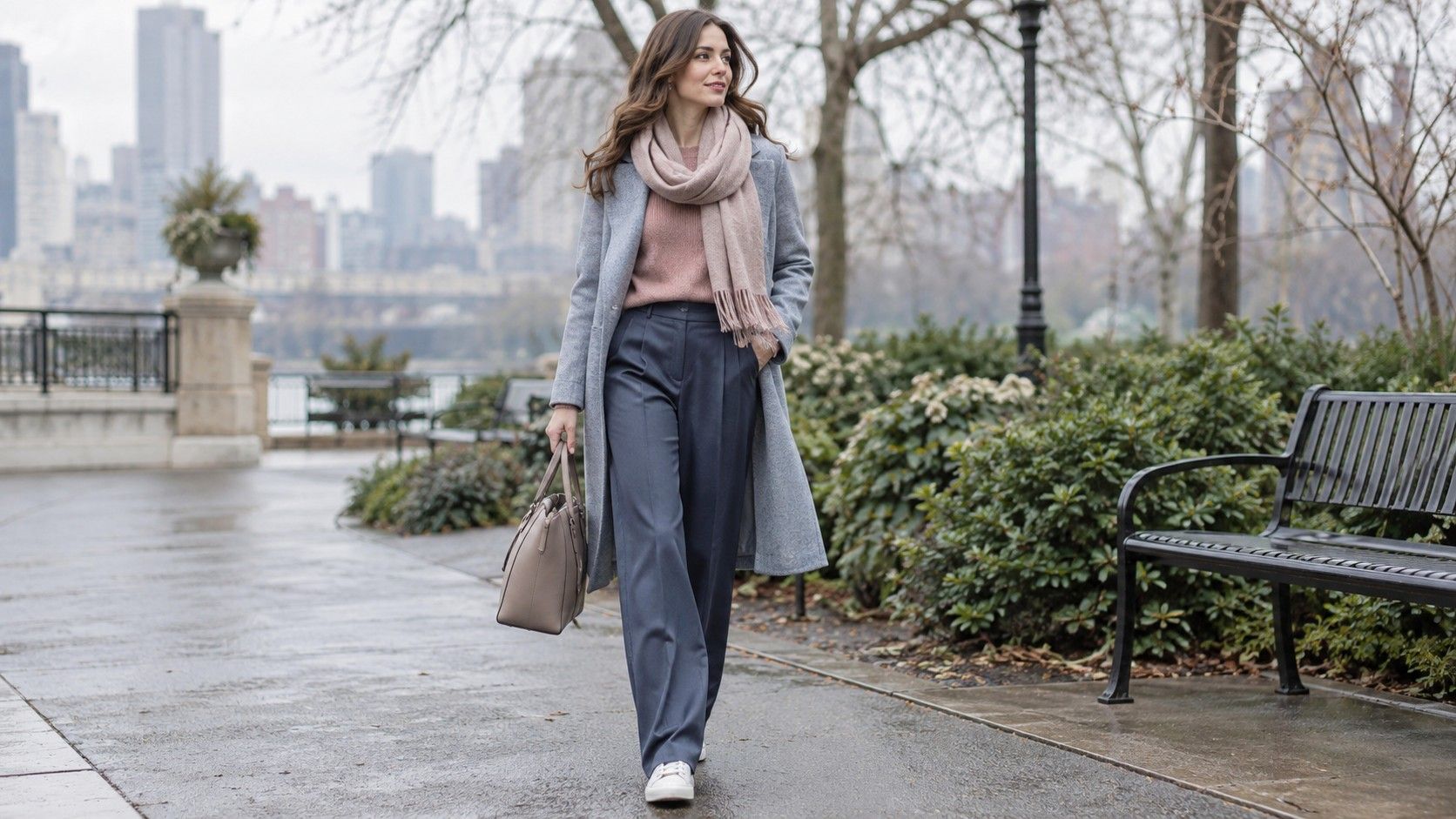
Soft Summer clothes are often described with a long list of muted blues, greys, roses, and greens. That list is less useful than understanding the visual mood those colors create: cool, softened, and low in contrast. The challenge is not finding pale dusty shades. It is using them with enough shape, texture, and depth that an everyday outfit looks intentional instead of faded, fragile, or as though it belongs to someone else's idea of a seasonal palette.
Use the palette as an editing tool, not a costume
The helpful part of Soft Summer is the reminder that softened color can be more harmonious than bright color. Soft navy, smoky blue, mauve, sage-grey, dove grey, and dusty rose all have some grey in them. They rarely shout from across a room, which is why they are easy to layer. The unhelpful part is treating every garment as a swatch-matching exercise. A wardrobe needs jeans, weather layers, shoes, and clothes for untidy real days, not just a row of pretty cards.
Start by noticing the colors you already repeat. Faded blue denim, washed charcoal, old rose, soft white, and medium grey often sit naturally beside the Soft Summer range. If a garment is slightly warmer or deeper but you wear it constantly, keep it. The label should explain why some combinations feel calmer, not overrule personal style. A soft palette can include dark denim, black accessories, or a burgundy coat when their value and texture make sense with the rest of the look.
Low contrast does not mean no contrast. It means you usually avoid placing an icy white next to black, then adding a saturated neon accent. Better contrast comes from close but visible differences: charcoal with misty blue, soft navy with dusty rose, or medium denim with a blue-grey knit. Those pairings create an outline without cutting the body into harsh blocks. When the clothes feel vague, the answer is usually a value adjustment, not a brighter lipstick or a new color season.
Build a calm neutral base that earns repeat wear
Soft Summer capsule wardrobe planning becomes easier when the neutral pieces are specific. Soft navy is more flexible than many people expect: it works as trousers, a coat, a cardigan, and a shoe, and it makes faded denim look deliberate. Charcoal, mushroom grey, cool taupe, blue-grey, and soft white are equally useful. Choose two dark neutrals, two lighter neutrals, and a denim wash you genuinely wear. That provides enough variation without sending every purchase into a separate color family.
Soft white deserves a test before it becomes the default. It is gentler than stark optic white and can give a low-contrast outfit a clean break at the neckline. Cream is sometimes fine, especially in linen or a warm-weather shoe, but a yellow cream can make muted rose and smoky blue look disconnected. In a fitting room, compare the top with your usual coat or jacket rather than judging it alone. An ivory shirt that seems harmless can create a warmer outfit every time you layer it.
Denim is the easiest bridge between palette language and a normal wardrobe. Mid-blue, faded indigo, grey-blue, and soft black denim all work, depending on the amount of contrast you like. Very dark raw indigo can look too crisp next to pale lavender or misty pink, while a worn medium wash makes those colors more relaxed. Keep one darker jean for structure and one lighter or softer wash for outfits where the top is already quiet.
| Neutral base | Color partner | Useful outfit setting |
|---|---|---|
| Soft navy | Dusty rose | Knit and trouser outfits for work |
| Blue-grey | Smoky sage | Casual layers with faded denim |
| Charcoal | Mauve or plum | Cool-weather outfits with definition |
| Soft white | Muted berry | Light top with a darker jacket |
Keep low contrast from turning bland
When Soft Summer outfits look flat, check the values before changing the hues. A pale blue shirt with pale grey trousers and light grey sneakers may be harmonious but visually unfinished. Add a medium navy belt, a deeper shoe, or a charcoal overshirt. One darker anchor is often enough. Conversely, if an outfit of navy, charcoal, and deep plum feels heavy, bring in soft white, misty blue, or visible skin at the wrist to open it up.
Silhouette supplies another kind of contrast. A fine-knit top with wide denim, a soft oversized blazer over a fitted ribbed tee, or a floaty skirt with a compact leather boot creates shape even when the colors are close. This is useful for people who dislike highly contrasting outfits but still want their clothes to look considered. Let one thing be loose and one thing be cleaner. A muted palette becomes much more modern when the proportions have a point of view.
Finish matters too. Matte wool, faded cotton, brushed suede, and washed leather naturally suit softened colors. A very glossy synthetic fabric can make dusty rose or sage look artificial, while the same color in cotton poplin or merino looks grounded. You do not need to avoid shine completely; use it in a small area such as a shoe, earring, or bag. A quiet outfit benefits from one light-catching detail, but too many polished surfaces can erase the subtlety that makes the colors work.
Choose prints and texture with a lighter hand
Prints work best when they preserve the same muted temperature as the solid pieces around them. Look for watercolour-like florals, fine stripes, broken checks, soft animal patterns, or abstract shapes that combine navy, grey, mauve, smoky green, and off-white. The scale should suit the garment. A tiny print on a blouse can read like a neutral under a jacket; a larger print on a dress needs simpler shoes and outerwear so it remains the main event.
Black-and-white graphic prints are not impossible, but they create more contrast than most Soft Summer clothes. If you love them, soften the effect with a blue-grey coat, faded denim, or a medium-grey shoe rather than adding more black. Similarly, a warm animal print can be made easier with charcoal or soft navy if the print itself is not overly orange. The surrounding pieces decide whether a print becomes a playful interruption or a temperature clash.
Texture can provide interest when you do not want a print at all. Try a ribbed knit with smooth trousers, a boucle jacket over a simple jersey dress, or washed denim with suede. Keep the color family fairly close and let the surfaces do the work. This approach is especially helpful in a small wardrobe, because a grey cardigan, blue jean, and muted rose top can create several different-looking outfits once the fabrics and proportions change.
Make the palette work for actual routines
Soft Summer outfits should survive commuting, laundry, weather, and a day when you do not want to think about clothes. Build one reliable formula for each situation. For casual days, medium denim, a blue-grey tee, and a soft navy layer are easy to repeat. For work, charcoal trousers, a muted berry or mauve knit, and a structured grey coat give enough authority without harshness. For evenings, deepen the same palette with plum, ink navy, or smoky teal rather than suddenly switching to bright jewel tones.
Outerwear deserves an early decision because it sits over everything. Soft navy, charcoal, blue-grey, and mushroom taupe are more adaptable than a very pale pastel coat. A dusty rose scarf or smoky sage bag can provide the lighter seasonal color in smaller doses. Shoes can stay practical: grey trainers, dark brown-grey boots, navy loafers, muted burgundy flats, and soft metallics all connect easily. There is no need for a separate shoe color for every top.
Use the Soft Summer idea to identify relationships, then leave room for preference. You may like a stronger berry lip, a black leather jacket, or a deep denim shirt because it gives the outfit the edge you want. If it feels good and the surrounding colors are quiet enough, it belongs. The most successful muted color outfits are not timid. They simply use a softer volume, clear proportions, and repeated colors that let the wearer arrive before the clothes do.