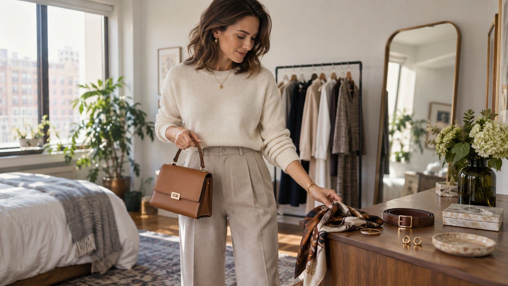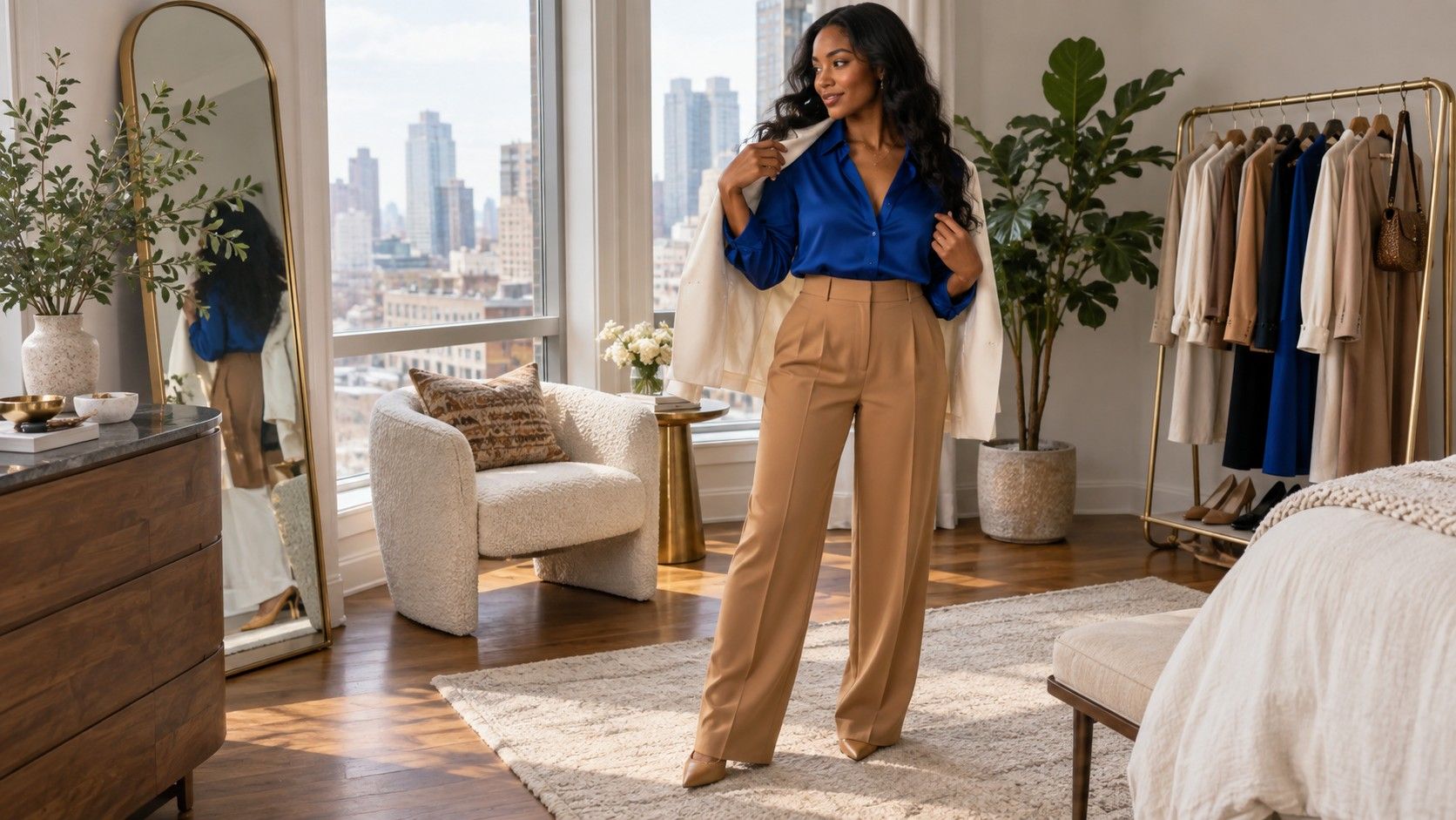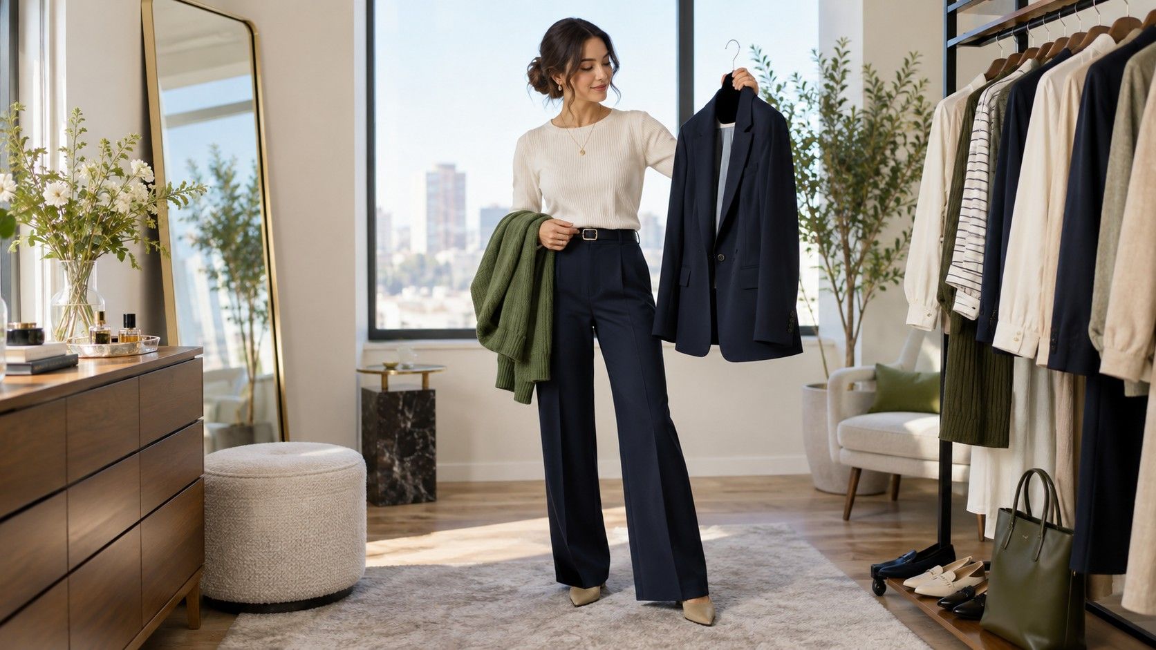
Work clothes get easier when color has a job beyond looking polished. It can make a small wardrobe feel more deliberate, keep a favourite sweater from reading too casual, and help an outfit survive a train commute, a meeting room, and an unplanned video call. The useful goal is not to dress in corporate beige; it is to find work outfit color combinations that make getting dressed less noisy while leaving room for your own taste.
Read the dress code that people actually follow
Start with observation rather than a rulebook. A team may officially say business casual, yet the daily picture can range from dark jeans and trainers to pressed trousers and a blazer. Notice what people wear when they present to clients, what they wear on a normal Tuesday, and whether the office lighting is harsh enough to turn pale grey into something almost white. Those details tell you more about useful business casual colors than a vague policy ever will.
Color also signals formality in quiet ways. Navy, charcoal, chocolate, olive, black, cream, stone, and deep burgundy tend to hold their shape in an office because they do not demand attention from across the room. That does not mean brighter colors are forbidden. A clear blue shirt, a soft red knit, or a moss-green blouse can feel entirely appropriate when the rest of the outfit is calm. The point is proportion: one expressive color is easier to wear than four separate ideas competing at once.
Before buying anything, take a quick inventory of the colors you already repeat without thinking. If you reach for navy trousers, white shirts, and tan shoes, that is already a working system. Building around it will look more coherent than replacing everything with a trendy palette that only works on the shop floor. Good office outfit ideas usually begin with the items that have already proved they can make it through a long day.
Build a dependable neutral base before chasing accents
A base neutral is the color that can appear in trousers, a skirt, a blazer, or an outer layer without becoming tiresome. Black is practical for some wardrobes, but it is not compulsory. Navy often feels softer near the face and pairs easily with light blue, ivory, camel, pink, and red. Charcoal has a slightly quieter effect than black. Brown, taupe, and olive can be excellent choices in offices where the atmosphere is relaxed or creative.
Choose the neutral according to real maintenance, not just a perfect mirror moment. Cream trousers look sharp until the rainy commute, crowded lunch counter, and espresso spill enter the picture. A pale blazer can be a useful indoor layer but may need a darker bag strap or coat for public transport. For many people, a dark trouser and mid-tone jacket are easier than matching a whole suit, because each piece can be washed and repeated on its own schedule.
It helps to make the base visible in at least two places. Navy trousers with a navy belt, charcoal trousers with a grey shoe, or brown loafers with a brown watch strap give the eye a small thread to follow. Exact matching is unnecessary and can look overly arranged. Similar depth is enough: dark brown leather beside chocolate knitwear looks connected even when the shades are not identical.
| Base neutral | Easy color partners | Useful in practice |
|---|---|---|
| Navy | Ivory, light blue, soft red, camel | Works for presentations and repeat outfits without feeling severe |
| Charcoal | White, dusty pink, forest green, silver | Good when black feels too sharp under office lights |
| Chocolate or taupe | Denim blue, cream, rust, sage | Relaxed but still composed for less formal teams |
| Olive | Ecru, navy, burgundy, muted peach | Useful as a trouser or jacket color when many people wear black |
Add color at a scale that feels comfortable
Once the base is doing its work, add color through one item that is easy to remove or repeat: a shirt, knit, scarf, shoe, or bag. This is less risky than making a bright blazer the only interesting piece in the wardrobe. A cobalt knit under a navy jacket is noticeable but controlled; a plum top with charcoal trousers has the same effect. If the color makes you check your reflection every hour, shrink its role next time rather than declaring it a mistake.
Use the setting to decide how much contrast you want. A day spent mostly at a desk allows more color in a cardigan or shirt because people see the outfit up close. A meeting on camera benefits from a clearer top-half color, especially if the background is pale. Very tiny prints and muddy grey-beige combinations can disappear on video, while a solid teal, berry, or medium blue usually reads cleanly without looking theatrical.
There is no need to force every color to flatter every skin tone in the same way. Hold a garment near your face in daylight if possible, then take one phone photo without a filter. If your eyes look more awake and your skin looks even, the shade is doing something useful. If the color seems to arrive before you do, try a quieter version: brick instead of tomato red, petrol instead of electric blue, or soft lavender instead of a cold violet.
Plan layers for a commute, air conditioning, and a camera
Layering is where otherwise good colors can become fussy. Give each layer a separate role: a base that feels fine indoors, a mid layer for cold air conditioning, and an outer layer for travel. When all three have equal visual force, the outfit can look busy before the day has started. A light shirt, medium knit, and dark coat usually create a readable order because the depths are different.
Keep the layer closest to the face intentional. A white collar under a dark knit can brighten navy or charcoal, while a warm cream tee softens brown and olive. If the shirt collar, cardigan, coat lining, scarf, and bag are all different colors, edit one of them. The simplest fix is often to make the scarf neutral and let the shirt do the talking.
Think about the point at which each layer comes off. A striking cardigan may look good with a coat on the street but leave a difficult color story when removed at a desk. Test the base outfit in a mirror before adding the outer layer. This small habit prevents the familiar situation where the coat was doing all the visual work and the rest feels unfinished by 10 a.m.
Repeat outfits without looking as if you gave up
Repeating is not the problem; repeating every element in the same arrangement is what makes a limited wardrobe feel narrow. Keep the same navy trousers and change the top-half color from light blue to cream to burgundy. Wear the same blazer over a striped tee one day and a fine knit the next. The silhouette remains dependable while the color balance shifts enough for the outfit to feel fresh.
A small laundry rhythm makes this easier. If one pair of trousers, one blazer, and two pairs of shoes need to work across a week, avoid building every look around a single white shirt or pale knit that must be washed immediately. Choose colors for work outfits that can handle a second wear when aired out: navy, charcoal, brown, olive, mid-blue, and deeper reds tend to be forgiving without hiding poor care.
Finally, take notes in the least glamorous but most useful way: a few mirror photos of outfits that felt easy. After a month, you will see which business casual colors keep returning, which shoes make the proportions work, and which bright pieces are only worn on optimistic Sunday mornings. That record is more valuable than a universal palette because it belongs to your actual workplace, your actual commute, and your actual style.