Prints can make an outfit feel personal, but they have a way of becoming louder once a coat, bag, shoes, and daylight are involved. The aim is not to make every pattern behave like a neutral. It is to give the print a clear partner and enough quiet space around it that the colors can register. A stripe, floral, plaid, or graphic becomes much easier to wear when you treat its background color, scale, and placement as practical choices rather than fashion trivia.
Start with one print you actually want to wear
The simplest route into wearing prints is to choose one that already feels familiar: a striped shirt, checked overshirt, small floral blouse, or patterned skirt. A print that makes you adjust it all day is not a good foundation, even if the colors are supposedly ideal. Comfort affects proportion. When you feel at ease in the piece, you are more likely to let it be the focus instead of covering it with another competing layer.
Look at the distance from which the print reads. Fine stripes can appear almost solid across a room, which makes them flexible with a colored cardigan or jacket. Large checks, high-contrast florals, and bold graphics announce themselves immediately. They usually need plainer companions, especially below the waist where a busy pattern can visually split the body into several parts.
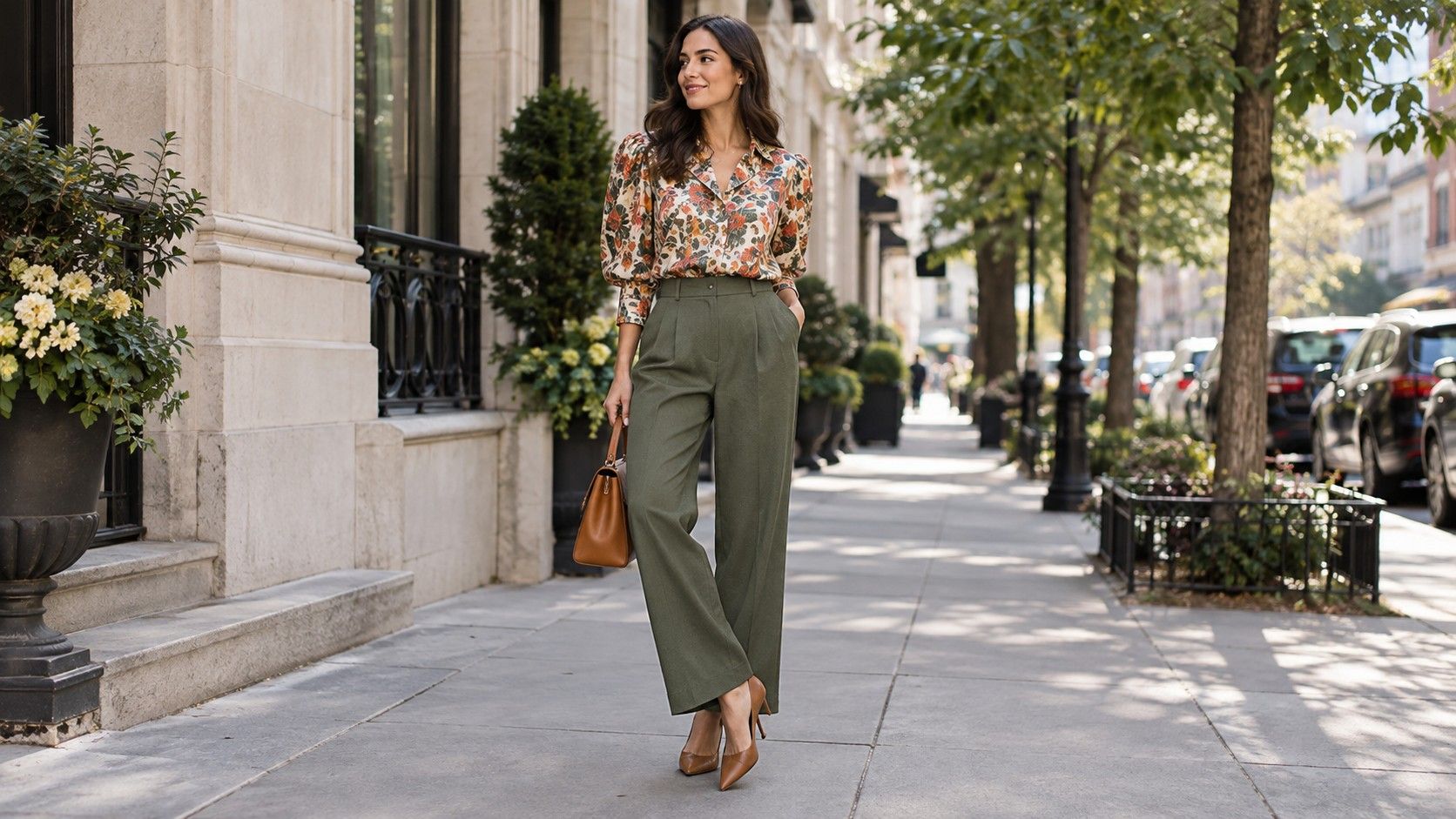
Start by pairing the print with a solid already found inside it. A navy-and-white stripe with navy trousers is not boring; it is stable. A floral dress with a green leaf or rust petal can take an olive jacket or brown boot. This is one of the most reliable answers to how to match prints and colors because the combination has an internal reason. You are not inventing a new color story; you are pulling out one that was already there.
Use the background color as the bridge
People often focus on the brightest detail in a print and miss the field it sits on. Yet the background color usually determines what the garment can pair with. A floral blouse with red flowers on a navy ground will relate more easily to navy jeans than to a red skirt. A pale plaid with a cream background can take ecru trousers or a camel coat, even if it contains a small bright blue line.
This bridge is useful with shoes and bags as well. If the print has a dark background, dark shoes often make the outfit feel grounded. If it has a light background, a cream trainer, tan sandal, or pale bag may keep the lower half from looking too heavy. Exact matching is unnecessary. A brown shoe can work with a beige-based print because both are warm and sit at a similar visual depth.
When a print has many colors, choose one to repeat and let the others remain inside the garment. Trying to echo every tone in a floral with jewelry, a bag, shoes, and knitwear turns a useful pattern into a puzzle. One repeated color is enough. Two can work when one is neutral and the other is small, such as navy trousers and a rust bag with a navy-and-rust scarf.
| Easy bridge color | Calm companion | |
|---|---|---|
| Navy and white stripe | Navy or denim blue | White trainer, tan shoe, cream knit |
| Small floral on dark ground | The dark background | Plain trouser, simple leather bag |
| Warm plaid | Brown, camel, or one dark line | Ecru tee, dark denim, quiet boot |
| Bold geometric graphic | One color from the graphic | Solid jacket and low-contrast accessories |
Mix scale before you try to mix several colors
Two prints can work together, but scale usually matters more than cleverness. A narrow stripe beside a large plaid has a better chance than two medium checks of equal contrast. The eye can tell which pattern is detailed and which one is broad. When both prints have the same size and energy, they tend to blur into visual noise, even if their colors technically belong together.
Keep one print farther from the face if you are still learning. A patterned skirt with a fine striped tee lets the face stay framed by a simpler neckline. A floral scarf can work over a small check shirt when the scarf has a larger, softer pattern and the rest of the outfit is plain. Take a phone photo rather than relying on the mirror: camera distance reveals whether the two prints have become one confusing texture.
Color can be the agreement between patterns. A blue-and-white stripe with a blue-and-tan plaid can work when both contain the same medium blue, even though one is cool and the other slightly warm. A black-and-white graphic tee can connect to a black-and-white micro-check, but add one solid layer in denim, camel, or black so the combination does not feel like a costume.
Keep one calm area in the outfit
Every successful print outfit has somewhere the eye can rest. It may be solid trousers, a plain blazer, a block-color coat, or an uncomplicated shoe. This does not have to be black. A navy trouser is calm beside bright florals, olive is calm beside warm plaids, and cream can quiet a dark stripe. The calm area gives the print its outline rather than making it disappear.
Accessories are a common place to overwork the look. A printed dress already has color and movement, so a plain bag and simple shoe may be all it needs. If you want a second print, make it small: a striped sock beneath dark trousers, a patterned lining that only shows when a jacket opens, or a scarf that shares the dress's background color. These details reward a closer look without shouting from across the room.
Consider the setting too. A print that feels lively at a weekend market may be tiring on a day with meetings, travel, and poor lighting. For those days, place the pattern in a shirt, scarf, or skirt and make the rest of the outfit more predictable. The best pattern outfit ideas are not the most complicated ones; they are the ones you can wear without needing to explain them.
Know when one print is enough
One print is often more interesting than several because it can be seen properly. If your outfit feels incomplete with only one, add texture before adding another pattern: suede shoes, ribbed knitwear, denim, leather, or a woven bag all create variety without introducing another drawing. This is especially useful with bright prints, which already carry enough contrast on their own.
A quick edit solves many difficult combinations. Take off the printed scarf, swap the plaid coat for a solid jacket, or change the graphic sock to a plain one. Notice which removal gives the first feeling of relief. That is generally the extra print, not the print you originally wanted to wear. Editing is not failure; it is how a good outfit keeps its point.
With practice, mixing prints and colors becomes less about a set of rules and more about seeing a hierarchy. One print leads, one color connects, and one calm item supports. Once those roles are clear, a striped shirt with a colorful skirt, a floral dress with a checked coat, or a plaid overshirt with a graphic tee can look intentional instead of accidental. The pattern has not become quieter; the rest of the outfit has learned how to listen.