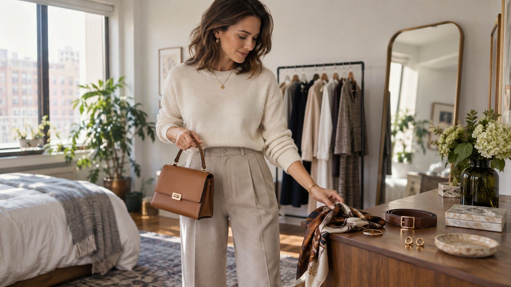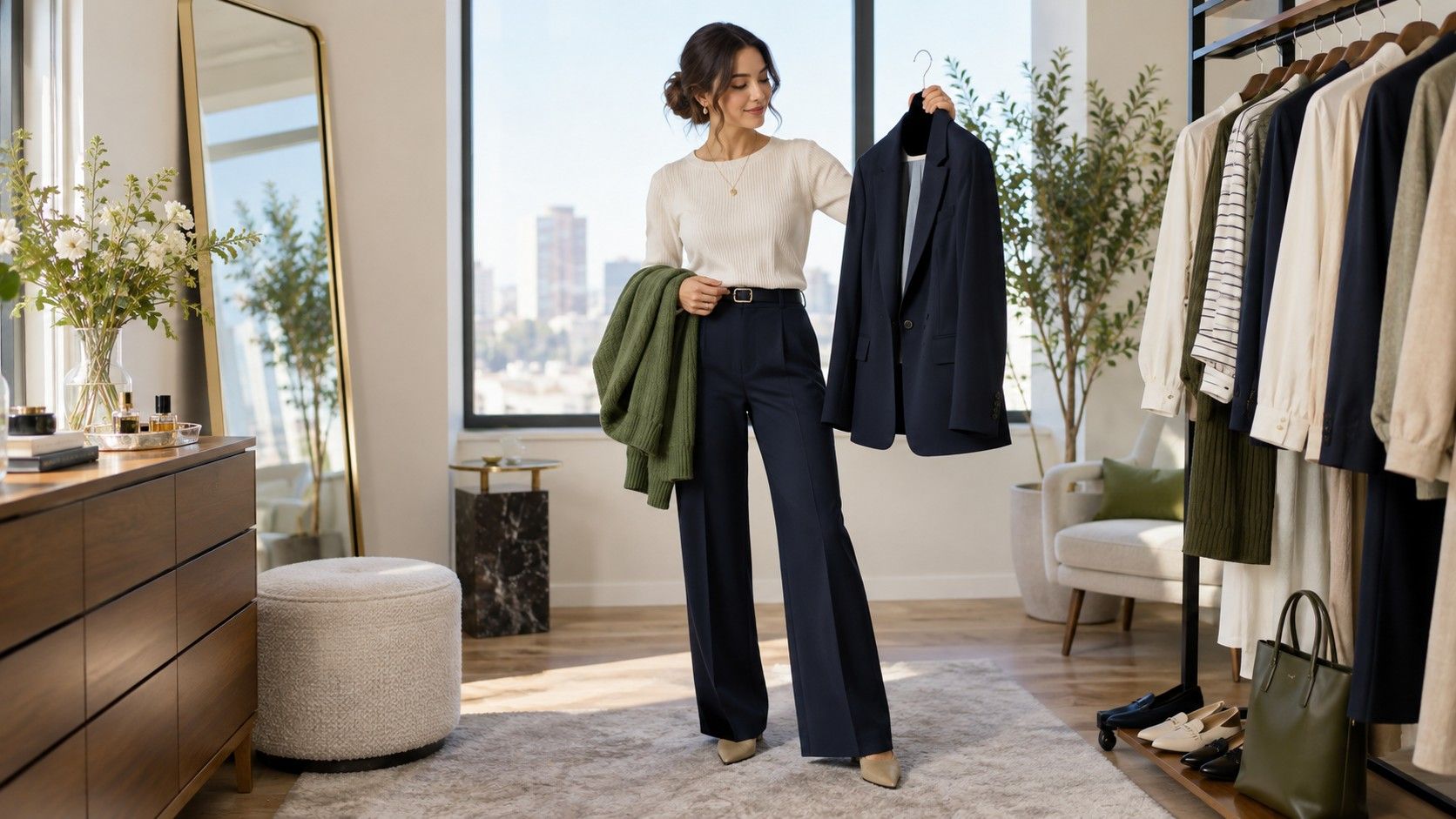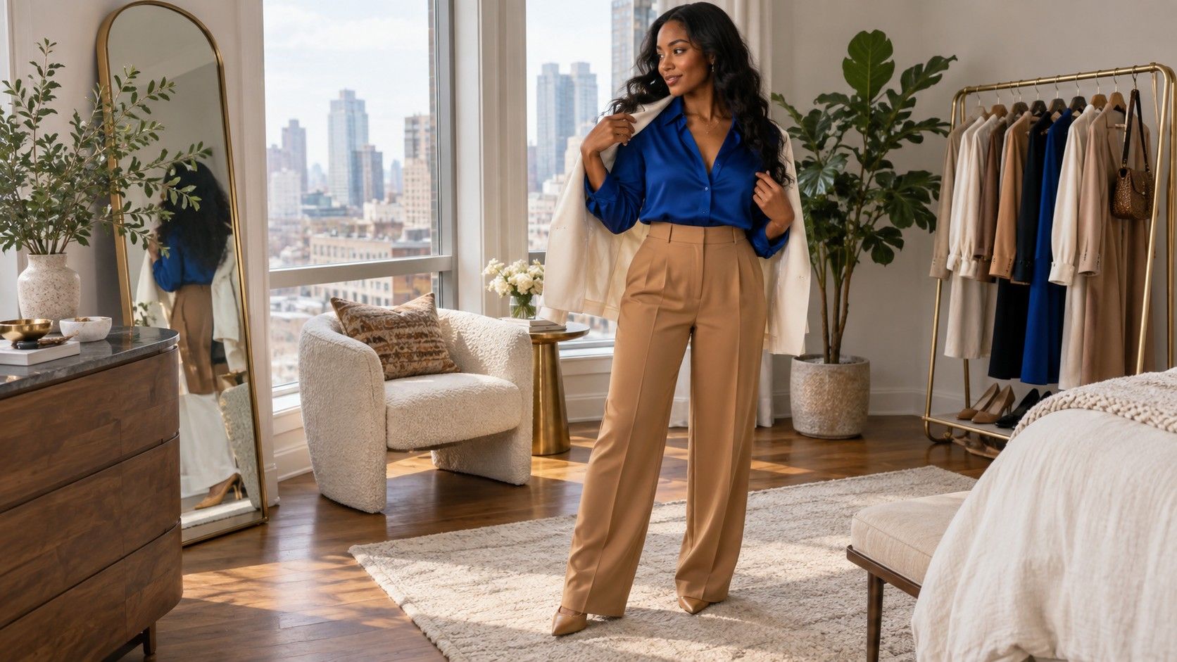
Outfit color formulas are useful when they make getting dressed faster, not when they turn every shirt into a mathematics problem. Most good clothing color combinations use a small number of roles: a base that is quiet, a second color that creates shape, and sometimes an accent that gives the look a little energy. Once you understand the roles, you can work with navy, denim, olive, pink, black, brown, or whatever is already in your wardrobe without copying a rigid chart.
Use formulas as a starting point, not a scoring system
The familiar 60-30-10 idea can help explain proportion, but real clothes are not painted walls. A long coat may cover most of the outfit outdoors, then disappear at lunch. Shoes and a bag can take more visual space than their size suggests because they sit at opposite ends of the body. Instead of counting percentages, decide which color is the background, which one is the supporting shape, and which item is allowed to be noticed first.
Begin with one reliable neutral. That could be dark denim, charcoal trousers, navy chinos, black skirt, cream knit, or olive utility pants. Then choose a second item that differs in either depth or temperature. Navy with soft white is crisp; navy with medium grey is quieter; navy with camel has a warmer contrast. When the first two pieces look settled together, an accent becomes optional. This order prevents a bright bag or shoe from having to rescue an outfit that was never coherent.
Pay attention to where each color appears. A high-contrast top near the face feels stronger than the same color in a shoe. A light trouser changes the whole body outline, while a light scarf only changes the neckline. If an outfit looks strangely top-heavy, move the bright or pale color down, or repeat it once in a smaller accessory. You do not need more colors; you need a clearer distribution of the ones you have.
Rely on the two-neutral formula for busy days
Two neutrals are the foundation of many outfits that look simple rather than unfinished. Examples include dark denim and soft white, charcoal and grey-beige, navy and camel, black and stone, or chocolate and cream. The neutrals should differ enough in value or texture that they do not blur together. If both are dark, add a visible collar, cuff, or shoe break. If both are light, use a darker belt, bag, or outer layer to give the outfit an outline.
Texture keeps a two-neutral outfit from becoming office uniform. Faded denim with a crisp cotton shirt feels different from smooth navy trousers with a fine merino top, even if the colors are close. Pair soft and structured materials: a wool blazer over a jersey tee, a ribbed knit with straight trousers, a suede shoe with a poplin dress. These contrasts are especially helpful when you prefer muted clothing and do not want an accent color in every look.
Do not force exact color matching between leather accessories. A dark brown bag, medium-brown belt, and brown-black boot can work together when their depth is similar and the clothing contains a neutral bridge. The outdated rule that every accessory must match often makes a practical outfit harder to assemble. What reads as intentional is a repeated family of tones, not identical dye lots.
| Formula | Example | When it helps |
|---|---|---|
| Two neutrals | Navy trousers, soft white knit, brown shoe | Fast work and travel outfits |
| Neutral plus accent | Grey denim, charcoal tee, berry cardigan | Color without a loud overall look |
| Tonal column | Stone trousers, taupe top, darker coat | Lengthening a simple silhouette |
| Denim plus one color | Blue jeans, forest green shirt, cream jacket | Relaxed weekends with structure |
Let one color be an accent instead of a collection
A color accent can be a cardigan, shirt, trouser, shoe, scarf, or bag. It does not need to appear in every accessory. If you are wearing charcoal trousers and a soft-white top, a berry cardigan already has enough visual authority. Add grey or black footwear, then stop. Repeating berry in a small earring or stripe can be attractive, but repeating it in shoes, belt, bag, and lipstick often makes the outfit feel planned too tightly.
Choose an accent that is compatible with your neutral rather than universally fashionable. Navy works with red, soft pink, green, mustard, and many blues, but each version changes the mood. Charcoal welcomes berry, pine, dusty rose, and icy blue. Olive can take cream, black, rust, denim, and deep burgundy. If you do not know where to begin, place the accent beside your most-worn coat. Outerwear is a practical test because it will be part of the outfit for much of the year.
Use saturated accents sparingly when the clothing cut is already dramatic. A bright red wide-leg trouser, a bold cobalt coat, or a vivid pink dress needs calmer partners than a small colored knit. In contrast, a muted accent can occupy a larger area without feeling overwhelming. This is why a soft green overshirt can be easy to wear every week, while an electric green one may need the rest of the wardrobe to step back completely.
Repeat a color once to make the outfit feel connected
Repetition is one of the simplest ways to learn how to match clothes colors. It can be literal, such as a navy knit with a navy stripe in the sock, or indirect, such as a burgundy shoe that echoes the depth of a berry print. The repeated note does not have to be obvious. It only needs to make the colors feel as though they share an environment. One large color and one small echo are usually more convincing than four unrelated shades.
Denim makes repetition easy because its blue can bridge cooler and warmer outfits. A blue jean can connect a navy top to tan footwear, a dusty pink sweater to grey trainers, or a forest green jacket to a brown bag. Consider denim a colored neutral rather than a separate casual category. Once you do, many outfits stop requiring a perfect matching shoe. The jean creates enough visual continuity for a slightly different leather or accessory tone.
Patterns provide another route. A checked shirt with navy, cream, and rust can connect navy trousers to brown boots. A scarf that contains grey and berry can tie a berry top to charcoal outerwear. Keep the print to one major item and pull only one or two colors from it. Trying to repeat every shade in a busy pattern produces the opposite effect: the outfit becomes a checklist instead of a complete picture.
Use monochrome and complementary color with restraint
Monochrome dressing does not mean identical shades from head to toe. It means working within one color family while changing depth, texture, or finish. Blue-black trousers, a slate shirt, and a navy coat form a dark blue column that looks more interesting than a perfectly matched suit. Taupe, mushroom, and stone can do the same job in a lighter direction. The layers need visible differences, otherwise the outfit can look accidental rather than tonal.
Complementary colors are strongest when they are adjusted away from their pure paint-box versions. Rather than bright orange with bright blue, try rust with navy. Rather than clean red with green, try burgundy with forest green. These pairings have contrast but retain enough depth to work in fabric. Let one color dominate and let the other appear in a smaller layer or accessory. Two equally saturated opposites are difficult to wear unless you want the outfit to be the main event.
When you test a new combination, photograph it from a distance. The mirror is good for checking fit; a photo shows whether the colors divide the body into awkward sections or carry the eye smoothly from face to shoe. If the combination is too loud, reduce one color to an accessory. If it is too quiet, add a darker shoe or jacket. This adjustment is more useful than rejecting the formula altogether.
Know when to break the formula
Some clothes ask for a less balanced treatment. A beautiful printed dress may need only neutral shoes and a coat. A statement red coat can sit over an all-grey base and do all the color work. A black suit may look best with a white shirt because the sharpness is part of the point. Formulas should support these choices, not make you second-guess them. They are there for the 80 percent of days when you want reliable structure with no drama.
Break the formula when personal style benefits from it, but break one thing at a time. If you wear a patterned trouser, keep the top plain. If you introduce a bright shoe, simplify the bag. If you are combining several warm and cool pieces, repeat one shared neutral to hold them together. The outfit can be expressive and still have a center of gravity. That is the difference between a playful mix and a pile of favourite items with no conversation between them.
Keep a few successful combinations in your phone notes or on a hanger at the end of the rail. A two-neutral outfit, a denim-plus-color outfit, a tonal look, and a one-statement-piece look will cover most occasions. Over time, outfit color formulas become less visible because you have internalized them. You will simply know that a navy base wants soft white or a muted accent, that olive needs a depth partner, and that a good shoe can finish an outfit without matching every other detail.