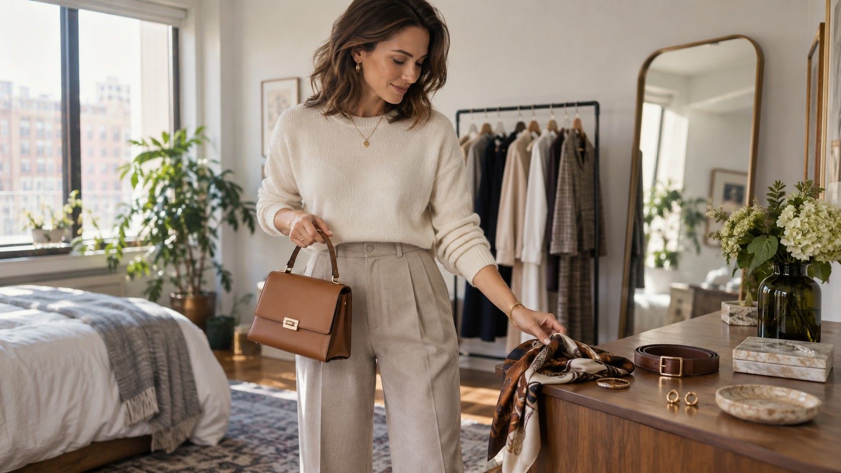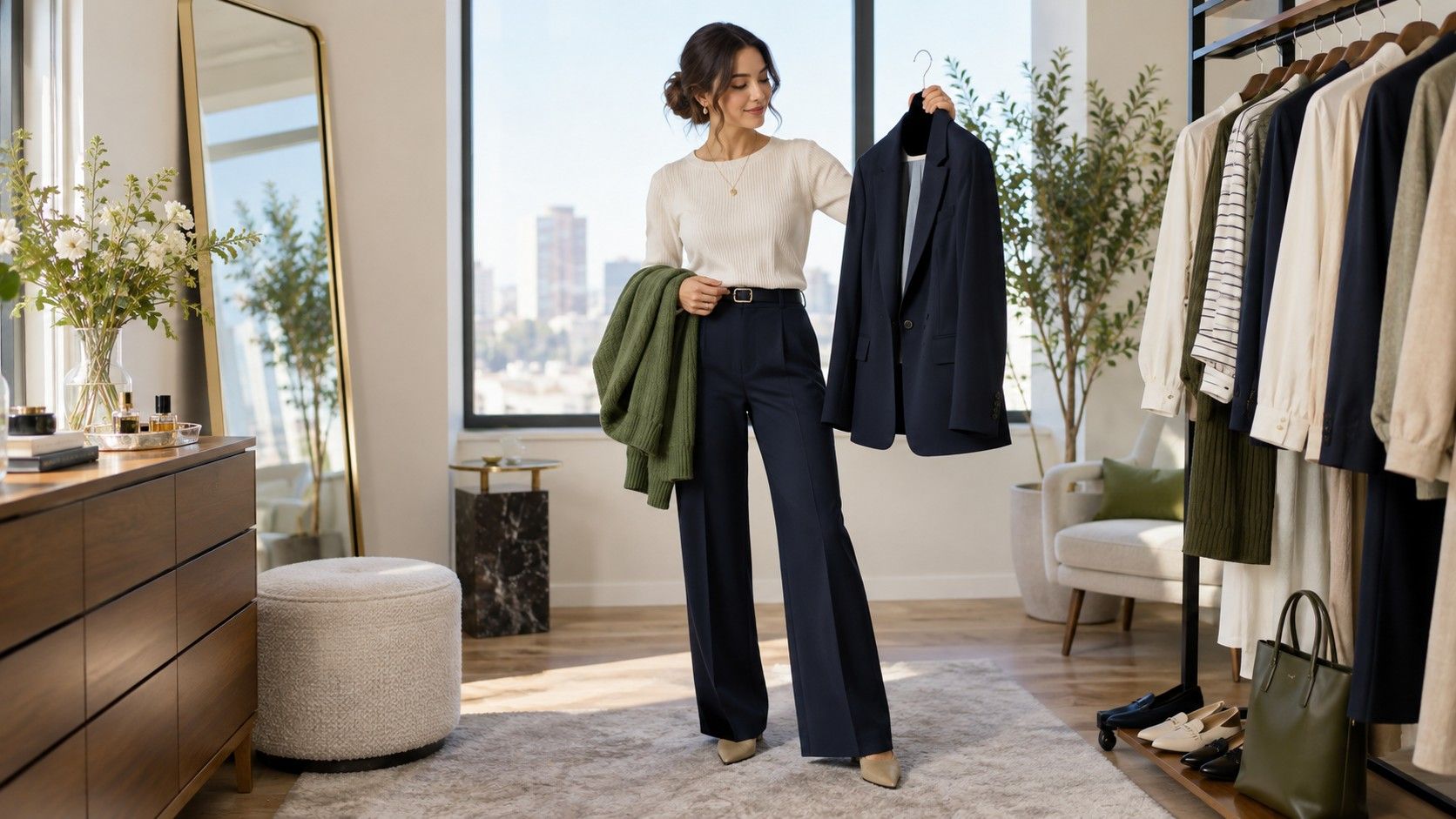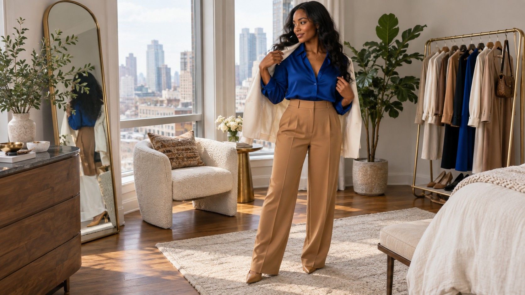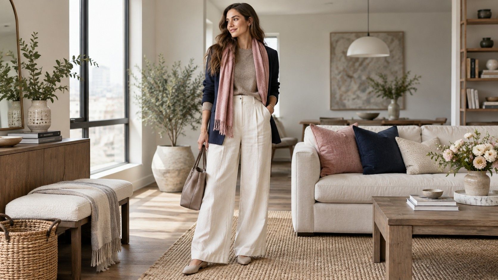
Having a neutral undertone sounds wonderfully simple until you stand in a fitting room with ten possible beige sweaters and none of them looks quite right. Neutral does not mean every color has equal power, and it does not mean you should default to bland middle shades. It usually means you have room to choose, provided you pay attention to depth, contrast, fabric, and the particular kind of warmth or coolness that makes you look awake.
Neutral is a range, not a permission slip for every shade
Neutral undertones often sit between clearly rosy and clearly golden skin, but the wardrobe question is more specific: do you look better in a little warmth, a little coolness, or a balanced mix? Most people have a preference even if neither extreme is disastrous. One person may look lively in olive and warm navy, while another needs charcoal, soft white, and muted rose. The difference becomes visible when colors are close to the face and the rest of the outfit is quiet.
Start by comparing neighboring shades instead of opposite ends of the spectrum. Put taupe beside camel, soft white beside cream, blue-grey beside warm grey, and rose beige beside peach. The better option will often make skin look clearer without making the clothing seem louder. If both work, note the setting: one may suit daylight and casual denim, while the other feels better with evening makeup or a structured jacket. That is useful information, not indecision.
Be wary of the phrase that everything suits neutral undertones. It encourages random buying and does not account for saturation. A bright clear yellow can overwhelm someone who is neutral and soft; a dusty olive can disappear on someone who is neutral but high contrast. Undertone gives you a flexible direction, while value and intensity decide whether a specific garment has enough presence. Treat those variables as equal members of the decision.
Find the temperature you reach for most often
Open the part of your wardrobe you actually wear and look for repetition. If navy denim, charcoal, cool taupe, silver, and berry scarves appear again and again, you may lean slightly cool in practice. If olive, cocoa, camel, muted gold, and warm ivory keep earning repeat use, you may lean warm. Many neutral wardrobes contain both groups, but the balance will reveal which side feels effortless rather than merely acceptable.
A simple outfit test is to wear a plain top in your most reliable neutral, then add a warm or cool layer. A navy T-shirt with a camel overshirt, then with a charcoal overshirt, tells you more than studying a color chart. Look at your face first and the garment second. Does one version make shadows around the mouth or eyes more obvious? Does one make the outfit look settled without needing a statement earring or bright lip color? Those reactions are practical evidence.
Temperature can change with texture. A warm taupe in brushed wool may feel softer than the same taupe in shiny satin. Cool navy in faded cotton is less severe than navy suiting. This is why a color that seems wrong online can work once you try it on, and why a supposedly flattering shade can feel harsh in a very smooth fabric. When in doubt, choose the texture you wear comfortably and then judge the color inside that context.
Use medium contrast as a dependable everyday base
Many neutral undertone outfits look their best at medium contrast: enough difference between pieces to show shape, but not a hard black-and-white jump unless you naturally enjoy that effect. Think blue denim with a soft white shirt, charcoal trousers with a muted rose knit, or olive chinos with a navy overshirt. These combinations have definition, yet they leave space for a face, haircut, or accessory to remain part of the picture.
When an outfit looks washed out, the problem is often value rather than undertone. A pale beige top with pale grey trousers may be too close in depth, even if both colors are flattering separately. Add a darker shoe, belt, jacket, or bag before replacing the whole outfit. In the other direction, a black top, dark indigo jeans, and black boots can feel heavy if there is no lighter break. A soft-white collar, a faded blue layer, or visible skin at the ankle can restore balance.
| Outfit base | Balanced addition | Why it works |
|---|---|---|
| Soft white and denim | Taupe jacket | Light and medium values keep the look open |
| Charcoal trousers | Muted rose knit | Cool structure with a gentle color shift |
| Olive utility pants | Navy shirt | Warmth and coolness meet at medium depth |
| Camel coat | Blue-grey scarf | A cool accent keeps camel from taking over |
Add warmth or coolness with one intentional piece
A neutral undertone wardrobe becomes more interesting when each outfit has a temperature direction. You might build a cool version with charcoal, soft white, navy, and silver; then make a warmer version with taupe, olive, denim, and antique gold. Both can work on the same person. What tends to fail is adding camel, icy lavender, bright coral, and black at once, then hoping the pieces will negotiate among themselves.
Rose is a useful bridge color because it can lean cool or warm without becoming sugary. Dusty rose works easily with navy and charcoal; a muted terracotta-rose can sit beside olive and camel. Similarly, green ranges from blue pine to yellow olive. If you have trouble choosing, decide which neutral is the anchor first. Navy makes a green read warmer; camel makes the same green read cooler. The pair matters more than a label on the hanger.
Jewelry and leather goods can set the temperature without demanding a new outfit. Silver, pewter, black leather, and slate suede pull a look cooler. Antique gold, chocolate leather, and warm tan suede introduce warmth. Mixed metals are entirely workable when they look intentional, especially if one metal is quieter. The goal is not strict coordination; it is to avoid several strong temperature signals competing near the face.
Edit flat outfits instead of abandoning the colors
When neutral undertone clothing colors feel dull, do not assume you need a brighter wardrobe. First check whether every piece has the same finish. Matte taupe knit, matte grey trousers, and matte beige sneakers can blur together even when the values differ. Add one tactile element: a leather belt, a ribbed sock, a washed denim shirt, a glossy loafer, or a woven bag. Texture gives the eye a place to rest and often makes moderate colors look more expensive.
Next, look for a single point of emphasis. A berry bag, dark green shoe, rose lip, printed scarf, or striped tee can stop a neutral outfit from disappearing. Keep the accent proportionate. If the base is taupe and navy, one berry item is usually enough; two may still be fine if they are small and separated. The result should feel like a choice made after getting dressed, not a desperate repair to a colorless uniform.
Photography is useful here because flatness can be hard to see in a mirror. Take a quick full-length picture from a few steps away. If the outline of the outfit remains clear but your face disappears, adjust the neckline color. If the face is fine but the clothes form one vague block, add contrast at the waist, cuff, or shoe. Small edits teach you more than another abstract rule about neutral skin tone colors to wear.
Create a working palette from clothes you already own
Choose four or five dependable neutrals, then add three colors that connect to at least two of them. A balanced example is navy, soft white, charcoal, taupe, and medium denim, with muted rose, olive, and deep teal as color options. Another is cocoa, cream, olive, faded blue, and dark brown, with berry, soft coral, and smoky green. Neither set is a prescription. It is a way to see whether a new purchase will join your existing clothes instead of becoming a lonely special case.
Build a few outfits before shopping: a casual version, a work version, a weather layer, and one look that feels slightly sharper. For instance, navy denim, soft white, and taupe can become a weekend outfit; switch denim for charcoal trousers and add a rose knit for work. The same taupe coat can sit over both. Repetition is not boring when the shapes, fabric weights, and one accent change. It is the basis of a wardrobe that gets worn.
Keep the palette open enough for personal taste. If you love strong red, make it your accent; if you prefer quiet clothing, choose a textured navy or deep olive instead. Neutral undertone outfits work best when the color guidance reduces friction rather than replacing judgment. Once you know your preferred temperature and contrast, you can evaluate a garment in seconds: it either supports the clothes you reach for, or it asks the rest of the wardrobe to become someone else.