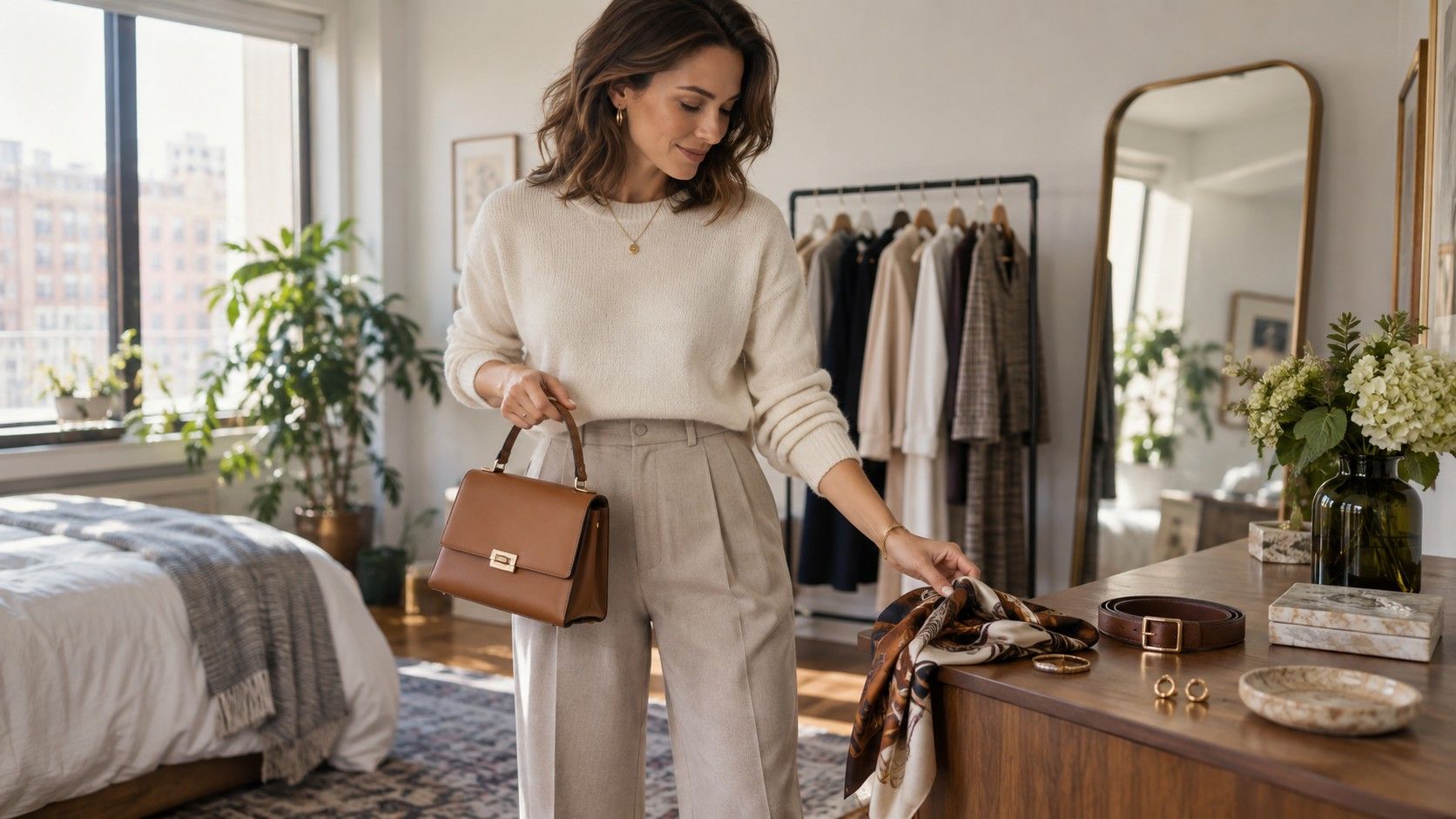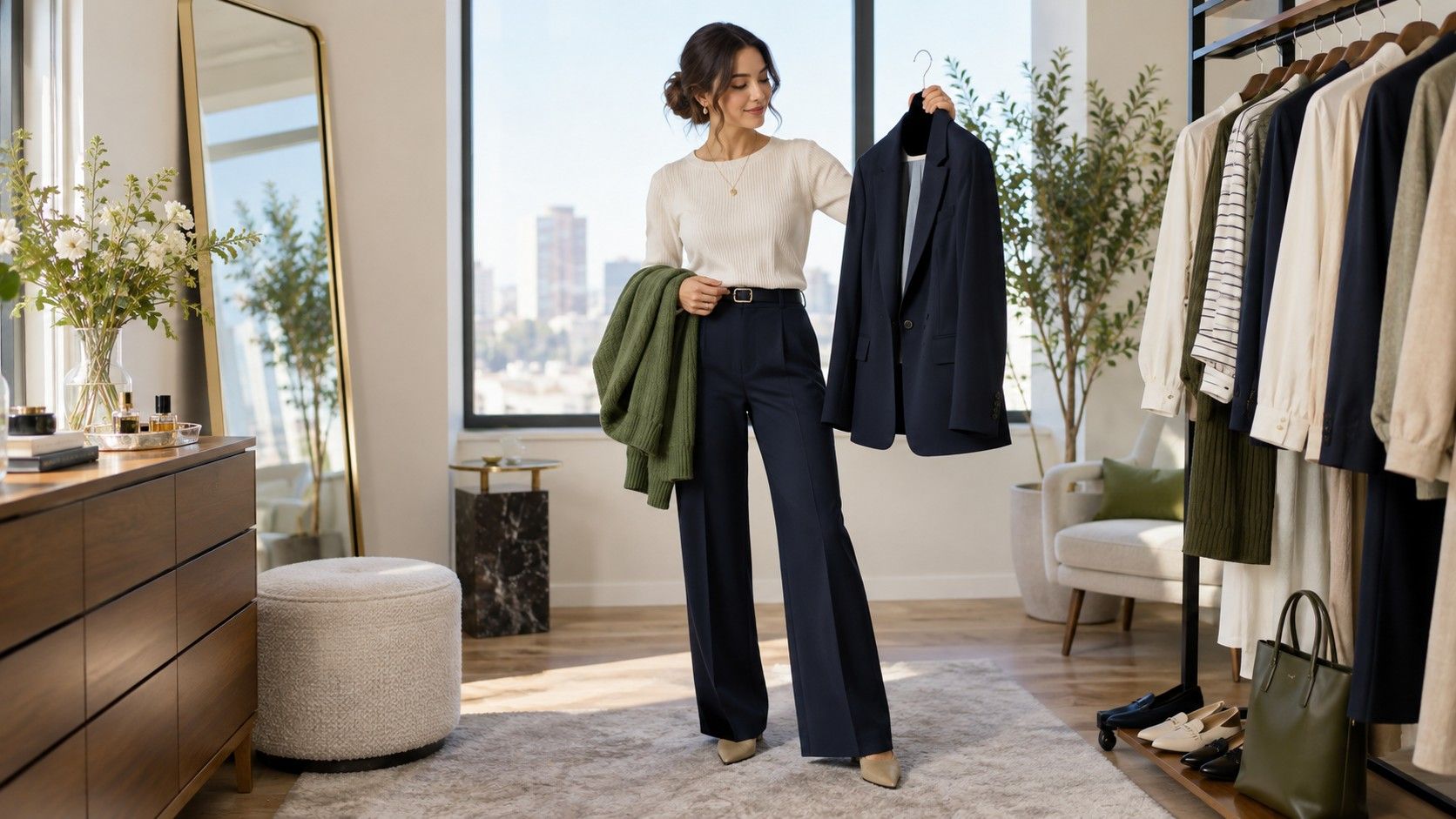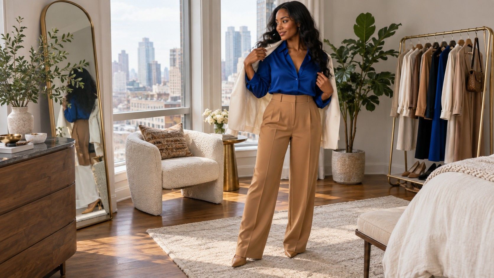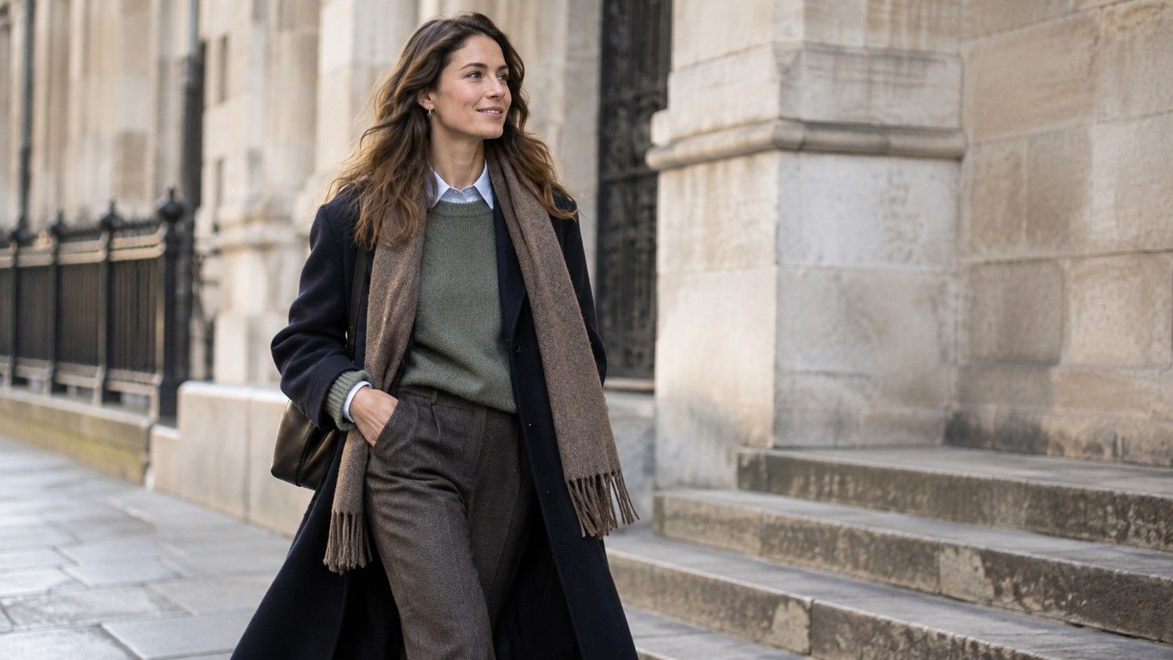
Layering makes an outfit useful in real weather, but it also gives every color another chance to get in the way. A shirt collar appears under knitwear, a coat frames everything, a scarf lands close to the face, and suddenly the shoes seem unrelated. The solution is not to wear only neutrals. It is to decide which layer carries the main color, which layers support it, and which small details can disappear without the whole outfit losing its balance.
Give every layer a job before you choose its color
Good layering starts with function. The base layer is what remains when you take your coat off indoors. The mid layer adds warmth or texture. The outer layer handles wind, rain, and the visual first impression. When those jobs are clear, color becomes easier to assign. A white tee might brighten a dark knit, a soft grey cardigan can quiet a colorful shirt, and a navy coat can hold the whole combination together on the street.
Problems begin when every layer tries to be the star. A red shirt, striped knit, checked coat, patterned scarf, and bright trainers may all be good pieces separately, yet there is no resting place for the eye. Try removing one item, or making one layer a close relative of another. A cream shirt under a camel knit and olive coat has several colors, but their temperature and depth create a sequence rather than a pile.
It is worth testing the outfit at the moment it will change. Take off the coat. Remove the cardigan. Button the shirt. A colorful layered outfit should still make sense in each version. This is particularly important for commuting, offices with cold air conditioning, and cafes where coats stay on longer than expected. If the base outfit looks unfinished without the coat, the coat has been asked to solve too much.
Choose a dominant color first, then decide where contrast belongs
For most everyday outfits, one color should take the largest visual area. It may be navy trousers, an olive coat, a charcoal suit, or a medium-blue pair of jeans. Once that choice is made, the next color can either soften it or sharpen it. Softening means nearby values: navy with faded blue, olive with sage, chocolate with tan. Sharpening means a clearer difference: navy with cream, charcoal with burgundy, camel with cobalt.
Contrast works best when it has a location. A light shirt under a dark sweater puts contrast near the face. A bright sock above a dark shoe creates a small intentional flash. A pale scarf inside a dark coat can do both warmth and framing. Scatter the same contrast in five places and it becomes visual static. If the shirt, socks, bag, scarf, and shoe laces are all bright, choose two and let the rest calm down.
Depth is often more important than exact hue. Burgundy, navy, forest green, and chocolate can sit together because they all have weight, even though they are different colors. A pale lemon tee, light blue shirt, and cream overshirt can also work because their lightness is consistent. The difficult mix is usually one intense, light, cool color placed beside several muted, dark, warm ones without a bridge between them.
| Dominant piece | Supporting layers | Small accent |
|---|---|---|
| Navy coat | Cream knit, light blue shirt, denim | Brown shoe or burgundy sock |
| Olive jacket | Ecru tee, chambray shirt, dark trousers | Rust cap or warm brown belt |
| Charcoal trousers | White tee, grey cardigan, black coat | Forest-green scarf |
| Camel overshirt | Black tee, dark denim, cream knit | Deep red bag or shoe detail |
Use texture to separate shades that are close together
When colors are similar, texture keeps them from blending into one flat field. A crisp pale blue cotton shirt under a brushed navy knit has enough difference even when both are cool colors. A ribbed cream sweater over smooth stone trousers makes a light outfit feel deliberate rather than washed out. Denim, wool, leather, corduroy, cotton poplin, and soft jersey all reflect light differently, which gives subtle palettes more shape.
This is especially helpful when you like neutral layering. Instead of trying to create interest with another color, vary the surface: a white tee, heather-grey sweatshirt, dark indigo denim, and suede shoe. The outfit is mostly neutral, but it does not look like a single block. In low winter light, those textural changes often show better than a faint difference between two nearly identical grey shades.
Be cautious with shiny fabric near other shiny fabric. A satin shirt under a glossy puffer can make the upper half feel louder than planned, while a matte knit or cotton shirt gives the eye a pause. The same applies to patterns. A finely striped shirt beneath textured knitwear is usually easier than a bold graphic top beneath a high-contrast plaid coat.
Connect the small accents without making them match exactly
Scarves, socks, bags, belts, and shoes can make a layered outfit feel resolved, but they do not need to form a matching set. Think in echoes. A burgundy sock can repeat the deep red in a small stripe. Brown leather shoes can relate to a tan belt, even if one is espresso and the other is cognac. A navy cap can relate to dark trousers rather than the coat. The relationship only needs to be visible once or twice.
Accessories are also a useful place to try a color before committing to it in a large garment. If you are unsure about orange with olive, use a rust scarf or patterned sock first. If it feels too warm, the experiment is easy to remove. A bright coat is much harder to ignore once you have already left the house, which is why it deserves a quieter supporting cast.
Shoe color deserves a final mirror check because it closes the line of the outfit. White trainers can lighten a dark layered look; black boots can ground pale trousers; brown shoes often warm navy and olive. If the shoe looks unrelated, repeat its depth somewhere higher up with a belt, watch strap, bag, or a tiny piece of the scarf. That is often enough to make it feel chosen.
Edit one layer when the outfit starts to feel crowded
When colors clash, adding another coordinating item rarely fixes the issue. Edit instead. Remove the scarf, swap the printed shirt for a solid one, or change the bright mid layer to a neutral knit. The best adjustment is usually the item with the least practical role. A coat that keeps you dry stays; a second decorative layer that only adds another hue is the easier sacrifice.
Use a doorway test before leaving. Stand a few steps from the mirror or take a phone photo in ordinary light. If you can immediately name the main color and the second color, the outfit probably has enough order. If you keep discovering a new stripe, trim, or accessory each time you look, it may need one quieter element. This is not a rule against personality; it is a way to let the personality show clearly.
Learning how to layer clothes colors gets faster with repetition. Keep a note of combinations that worked on a cold morning and still looked good after the coat came off. Over time you will notice your own dependable families: perhaps navy, cream, and brown; perhaps black, grey, and acid green; perhaps olive, denim, and rust. Those are more useful than a universal color chart because they have already survived your weather, your schedule, and your wardrobe.