Cool undertones can be a useful clue when a wardrobe feels oddly unsettled: the individual pieces are good, yet camel pulls yellow, coral feels louder than expected, and a favourite navy sweater suddenly makes everything look sharper. The aim is not to diagnose yourself or ban half the color wheel. It is to notice which temperature, depth, and contrast make your clothes look deliberate, then repeat those choices in ordinary outfits.
Start with the way color sits next to your face
Cool undertone colors usually carry a blue, rosy, or blue-grey cast rather than a golden one. That does not mean every cool blue will be flattering, because depth matters too. A pale person can be overwhelmed by saturated cobalt, while someone with naturally high contrast may find misty blue too quiet. Try tops near your face in daylight, with no tinted mirror lighting, and compare the effect on your skin, eyes, and under-eye area rather than judging the garment alone.
A useful first comparison is soft white versus cream. Soft white has a little grey or blue in it and often gives cool skin a cleaner edge. Cream may still work, especially in a heavier fabric or farther from the face, but a yellow-leaning version can make the whole outfit feel separate from you. The same test works with grey: blue charcoal, dove grey, and graphite often feel composed, while beige-grey with a noticeable yellow cast may look dusty.
Do not make decisions from one small swatch. A blouse has a neckline, sheen, and amount of skin exposure; a scarf changes the test again. Photograph two options outside or by a north-facing window, then look at the image later. The better color often reads less dramatic in the mirror but lets your face appear more rested. That quieter effect is more valuable than a shade that wins attention on the hanger.
Build cool-neutral outfits before adding accent colors
For cool undertone outfits, neutrals do much of the difficult work. Navy, charcoal, blue-black, cool taupe, mushroom grey, stone, and soft white create a base that is easy to repeat. Navy is particularly useful because it can replace black at work and still look relaxed with jeans. Charcoal gives black-like structure without the hard outline that pure black can create on some people. A cool stone trouser can make berry, pine, or dusty blue feel current rather than overly coordinated.
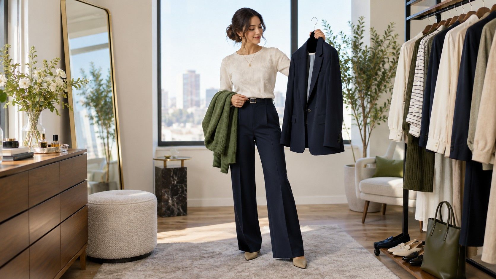
Choose two neutrals that differ in value, not necessarily in temperature. For example, charcoal trousers with a soft white shirt create enough separation to look finished. Navy denim with a medium-grey knit is gentler and better for low-contrast days. If both pieces are close in depth, use a shoe, belt, or bag to add a small break. The point is not to collect perfectly matched greys; it is to keep the background calm so one color can have a clear role.
Fabric changes a neutral more than people expect. Brushed flannel softens charcoal, smooth leather makes it more formal, and faded denim introduces a casual blue cast. When a neutral feels too severe, change the texture before assuming the color is wrong. A graphite T-shirt and graphite suiting can look unrelated in mood even though they are close in hue. Treat the material as part of the color decision, especially when assembling clothes you already own.
| Base neutral | Easy companion color | Practical use |
|---|---|---|
| Navy | Berry or soft white | Work layers and dark denim outfits |
| Charcoal | Pine or dusty rose | Knits, trousers, and outerwear |
| Cool stone | Plum or steel blue | Light trousers and spring layers |
| Blue-black | Cool red or silver grey | Evening pieces with a clean edge |
Use red, green, and purple with enough clarity
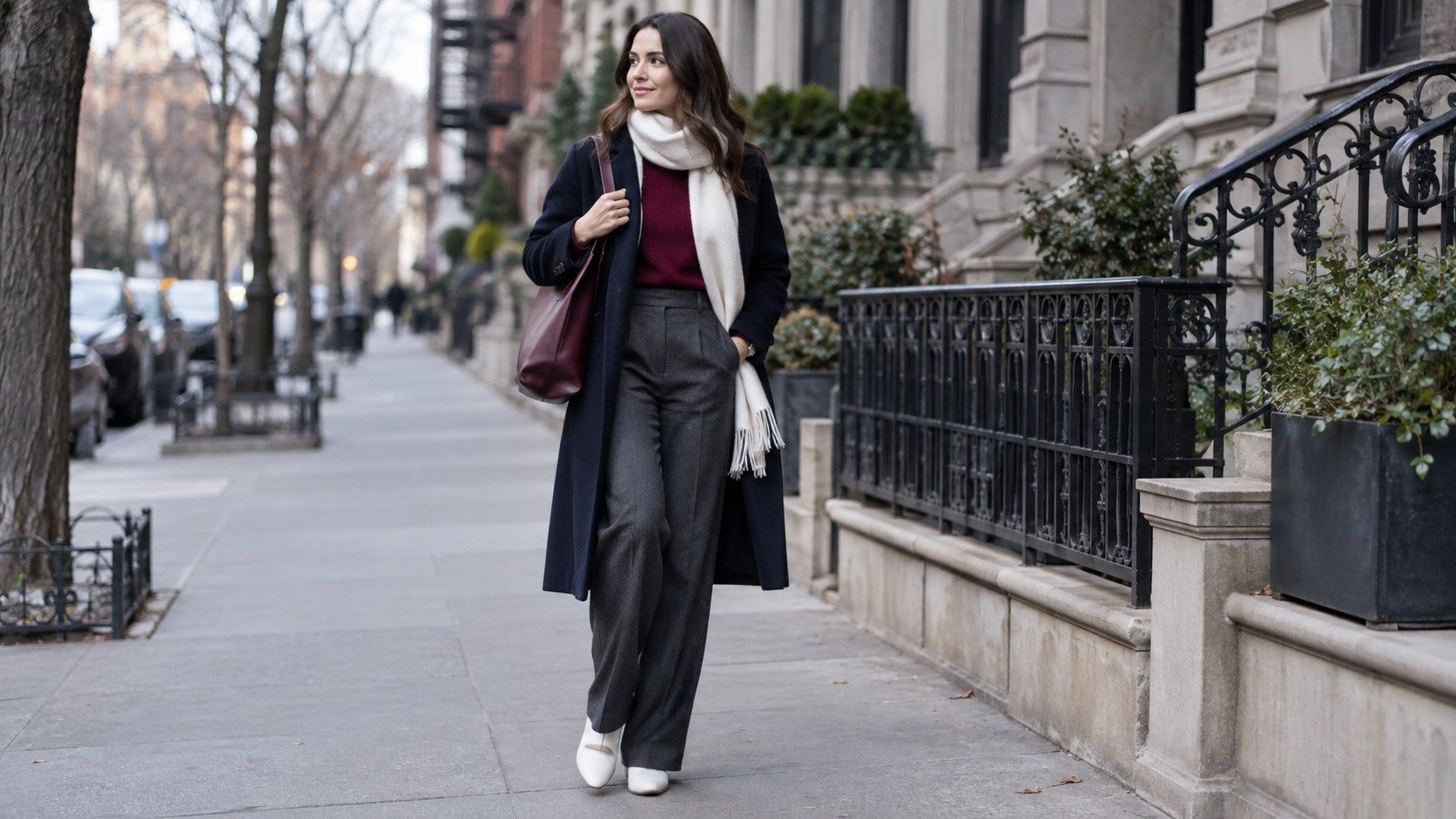
Cool red is often easier to wear than people assume. Look for berry, cranberry, ruby, or a blue-leaning wine rather than tomato or orange-red. The wearable version does not need to be bright: a deep cranberry sweater with charcoal trousers has more presence than an all-grey outfit, but it still feels grounded. If red near the face feels too direct, use it below the waist in a skirt, trouser, shoe, or bag and keep the top neutral.
Green is less about finding one correct shade and more about avoiding obvious yellow. Pine, blue spruce, cool emerald, and deep teal can work beautifully with navy and grey. Olive is more variable. A smoky olive with grey in it may be easy, while a bright military olive can look warmer and tougher than intended. Hold it next to charcoal rather than camel; the pairing reveals whether the green belongs to the cool side of your wardrobe.
Purple and pink are valuable because they create color without the visual heat of orange. Dusty rose, mauve, plum, lilac-grey, and blackberry can all play different roles. A muted mauve blouse is a soft work option, while plum trousers act almost like a neutral with black boots. Instead of matching the shade in every accessory, repeat only its darkness or softness. That small echo makes the outfit coherent without turning it into a theme.
Handle warm colors as adjustments, not forbidden territory
Cool undertones do not require a life without brown, tan, mustard, or peach. The practical question is how much warmth sits near your face and how saturated it is. A cool person may prefer cocoa over orange camel, rose beige over yellow beige, and wine over brick. Warm colors often become easier when they are softened, deepened, or balanced with navy, charcoal, silver, or denim. A cinnamon skirt with a soft grey knit is a different proposition from a cinnamon sweater at the neckline.
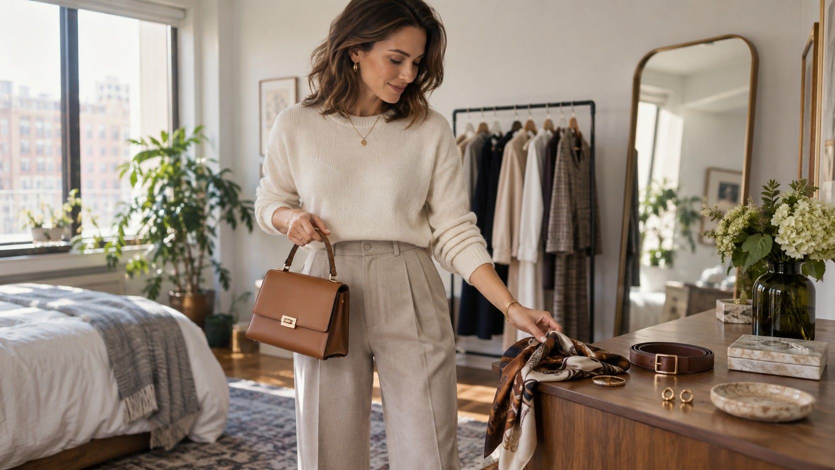
Accessories are a low-risk way to test warmth. A cognac bag may work because it occupies a small area and sits away from the face, while a warm tan scarf can dominate an otherwise cool outfit. Gold jewelry can also work if it is muted, antique, or mixed with silver rather than strongly yellow. There is no prize for making every metal and leather detail perfectly cool. The outfit only needs a believable temperature balance.
When a warm garment is a favourite, give it a cool partner rather than trying to correct it with makeup or more color. Pair rust trousers with a navy blouse, a warm brown coat with a berry scarf, or a beige dress with charcoal tights and slate shoes. Notice whether the warm item becomes an intentional accent. If it still seems to arrive before you do, it may simply be better as a lower-body piece or an occasional statement rather than a wardrobe basic.
Make repeatable cool undertone outfit formulas
Formulas are useful because they remove the morning argument with the closet. One reliable option is dark cool neutral, light cool neutral, then one restrained accent: navy jeans, soft white T-shirt, berry cardigan. Another is tonal dressing: charcoal trousers, slate knit, graphite coat, with a silver earring or cool red lip adding a small point of contrast. These combinations are not rules; they are starting places that show what your best colors do together.
For a more polished outfit, try a deep neutral column with one colored layer. Blue-black trousers and shoes make a pine blazer or plum shirt look intentional, especially when the fabric weights are different. For weekends, faded blue denim, a dove-grey sweatshirt, and a dark berry sneaker or bag give the same cool structure with less formality. Repeating one color twice is usually enough. A berry top and a tiny berry stripe in a scarf are linked; berry shoes, bag, belt, and lipstick would be too insistent.
Keep a short phone album of outfits that worked in normal light. Include the failures too, because they reveal patterns: perhaps warm beige is fine with navy but not with black, or black needs a silver-grey collar to feel less stark. Over time, colors for cool undertones become less of a seasonal label and more of a practical editing tool. You will know which neutrals earn their space, which accents wake up the wardrobe, and which pieces need a different supporting cast.