A color test for clothes does not need a salon mirror, a stack of paint chips, or a verdict about who you are. It needs a little daylight and a way to compare fabrics honestly. The point is not to discover a tiny approved palette; it is to notice which colors make your face look awake, which ones fight the rest of an outfit, and which misses are only a lighting problem.
Set up lighting that does not flatter every color equally
Start beside a window in indirect daylight. North-facing light is steady if you have it, while harsh noon sun can bleach a pale shirt and make a warm sweater look louder than it will at the office. Turn off overhead bulbs for the first pass. Their yellow or cool cast is useful later, but it is a poor judge when you are trying to see the fabric itself.
Use the same mirror and stand at the same distance for every comparison. A bathroom mirror under a ceiling spot can make nearly any color look theatrical; a full-length mirror across a bright room can hide the face entirely. Pull your hair back if it is very bright or very dark, remove tinted glasses, and keep makeup light or consistent. This is a clothing color test, not a test of whether a particular lipstick is doing all the work.
Compare fabrics close to the face instead of judging a whole outfit at once
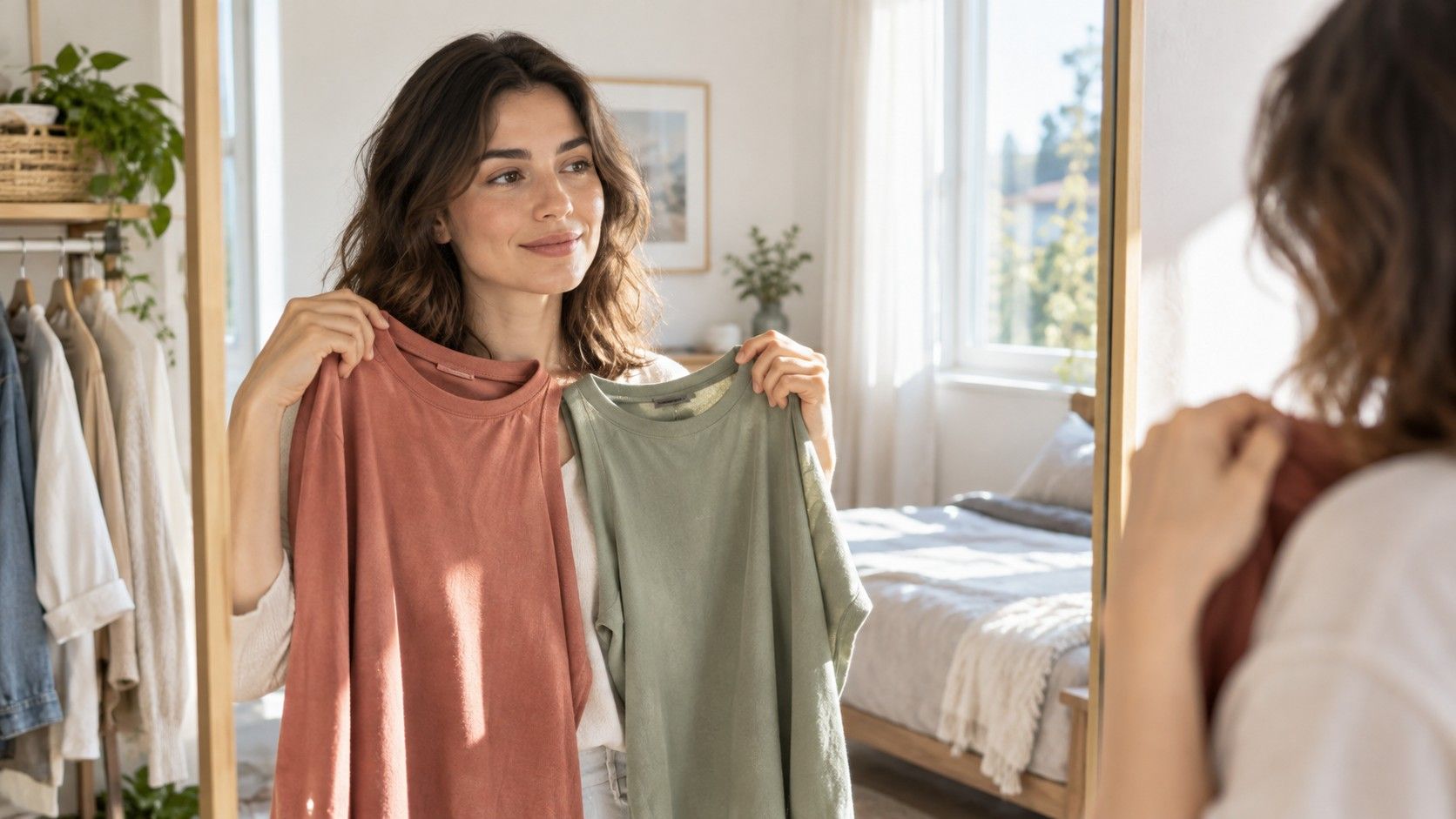
Gather six to ten tops, scarves, or even clean pillowcases in colors you already wear. Hold each one beneath your chin, then swap it for a nearby alternative: cream against stark white, navy against black, rust against berry, muted sage against clear teal. The useful information is often in the pair, not in a single color held up with nothing beside it.
Look first at your skin around the nose, mouth, and under the eyes. A workable color usually leaves the face readable; an awkward one can make shadows look stronger, bring out surface redness, or make the eyes seem to disappear. None of that means the color is forbidden. A dramatic black turtleneck may still be exactly right for an evening outfit. It simply asks for a different balance elsewhere, such as a brighter earring, softer jacket, or more visible lip color.
Read contrast without treating it as a personality test
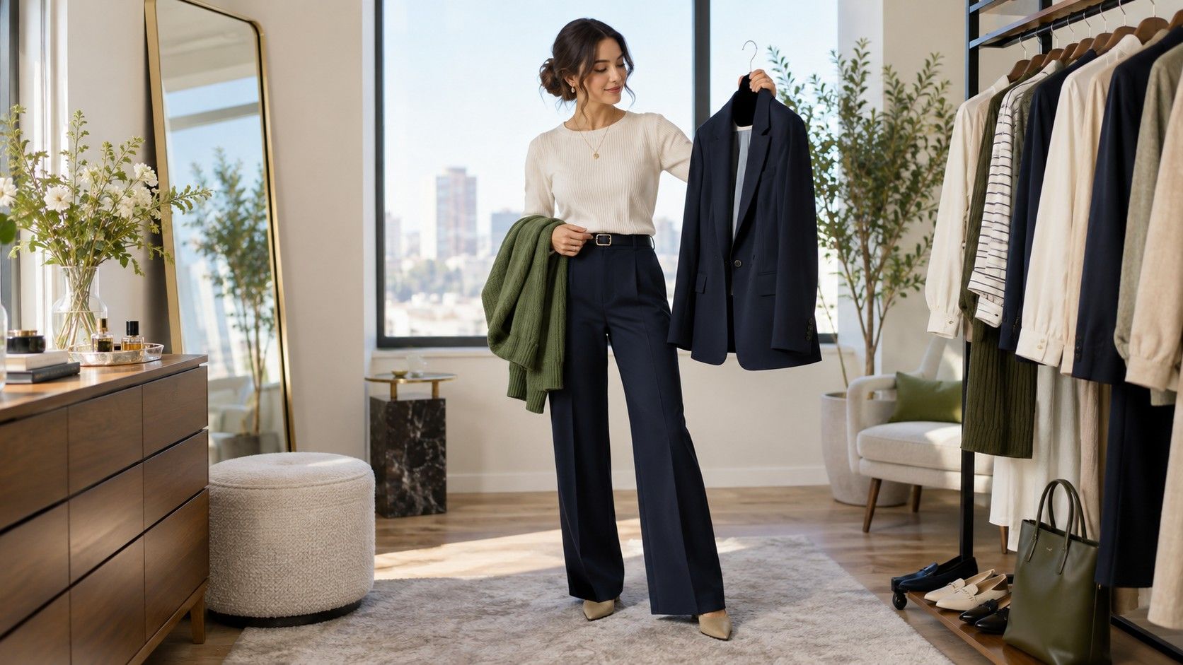
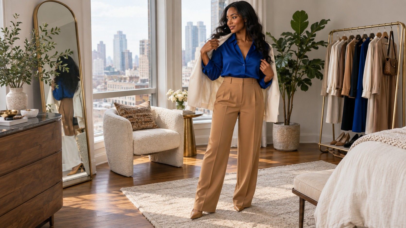
Contrast is the distance between the lightness of your clothes and the lightness of your coloring, plus the difference between the colors themselves. A charcoal shirt with pale jeans has more value contrast than a dove-gray knit with stone trousers. A cobalt blouse with tomato-red trousers has more color contrast than a cream blouse with camel trousers. Both can work; the question is whether the combination looks intentional on you and feels comfortable to wear.
Try three versions of the same idea. Put a light top with light trousers, a mid-tone top with dark denim, and a deep top with a lighter bottom. Take a quick photo of each from the same place. The camera is not more truthful than your eyes, but it removes the constant movement of a mirror and makes proportion easier to notice. If one version only works when you squint, it probably needs a clearer shoe, belt, or outer layer.
| What you compare | Useful question | Common false signal |
|---|---|---|
| Cream and white | Which leaves the face clearer? | Warm room lighting makes cream win by default. |
| Navy and black | Which gives definition without heaviness? | Black can look sharper in a close mirror, then feel severe outdoors. |
| Muted and bright shades | Which supports your features rather than arriving first? | A bright color may be right, but need a quieter partner. |
| Light and dark layers | Where does the eye land first? | One phone photo can flatten texture and depth. |
Test color in the outfits you actually leave the house in
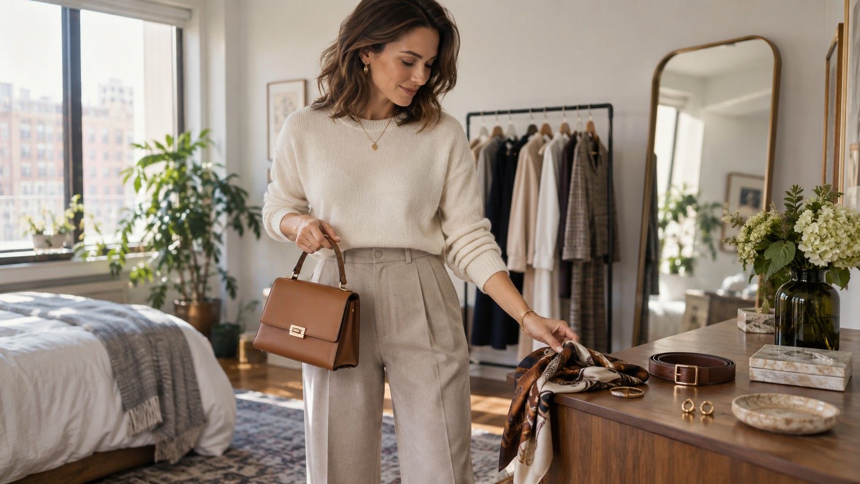
A scarf under the chin is a good beginning, not the final answer. Put the promising colors into a normal weekday outfit with your usual jeans, trousers, shoes, bag, and coat. A soft blue shirt can look fresh on its own, then turn dull once it sits under a taupe blazer. A brown knit that seemed heavy by the window may become excellent with white trainers and medium-wash denim.
Pay attention to fabric as well as hue. Matte cotton absorbs light differently from satin, brushed wool, ribbed knitwear, or thin jersey. A warm camel in a fuzzy cardigan can feel gentle; the same camel in shiny synthetic fabric may look much more yellow. When a color seems questionable, change one variable before giving up on it: try a different texture, move it farther from the face, or add a neutral layer between it and your skin.
Use neutral colors as controls, not as a hiding place
Keep a white or ivory shirt, medium denim, charcoal, navy, and one brown or camel item nearby while you test. Neutrals reveal how a color behaves. If a green top becomes better with charcoal but muddy with camel, that tells you more than a seasonal label ever will. If a pink blouse only looks good with a very specific beige, it may still be useful, but it belongs in a smaller part of your wardrobe rather than becoming a default purchase.
Notice the difference between a neutral that disappears and one that creates room around the face. Some people find optic white crisp but too hard; others find oatmeal gentle but drained. The answer can shift with hair color, a tan, a beard, or the contrast of your glasses. That is why a clothing color test is worth repeating at the start of a new season instead of treating last year's photo as a permanent ruling.
Keep notes that make the next shopping decision easier
Make a short phone note after the session. Write observations, not commandments: “deep navy works better than inky black near my face,” “clear teal needs simple denim,” or “cream works when the fabric has texture.” Add two or three photos in daylight. A small record is more useful than trying to remember why a sweater stayed unworn for months.
When shopping, compare the new item to those notes and to a familiar top rather than relying on a changing-store-room mirror. Bring a white T-shirt or take a photo near the entrance where daylight reaches. If a color is only convincing under one flattering lamp, leave it. The best result from an at-home color test is not a strict palette; it is a calmer eye for the combinations you will wear repeatedly.