A color chart for clothes can save time when an outfit feels almost right but somehow unfinished. It cannot choose your coat, solve fit, or know whether you want to be noticed. What it can do is show why two colors compete, why a neutral looks washed out, and where one small accent will do more than adding a fourth color just because the wheel says it matches.
Use a chart as a map, not a set of matching handcuffs
Most clothing color charts begin with the color wheel: colors beside each other are analogous, colors opposite each other are complementary, and colors spaced around the wheel make a triad. Those terms sound grander than a weekday wardrobe needs. In practice, the wheel gives you a few routes when you are deciding whether olive works better with rust, navy, or pink.
The missing part is that clothes are not flat dots of pigment. Denim is textured blue, leather shoes have shine, and a cream jumper may lean yellow, gray, or pink. Use the chart to choose a direction, then put the actual garments together. A printed guide that says blue and orange are opposites does not require a cobalt shirt with orange trousers. It may simply suggest that dark denim and a small cognac bag will feel lively together.
Choose value before you worry about the exact hue
Value means how light or dark a color appears. It is the first thing people usually see from across a room, even before they register whether a jacket is forest green or bottle green. A two-color outfit becomes easier when you decide whether you want low contrast, medium contrast, or a clear light-dark split. Stone trousers with a pale blue shirt are quiet; the same trousers with a navy shirt are more defined.
Try the outfit in a phone photo and turn the image briefly to grayscale. If every piece turns into the same gray mass, the look may need a lighter collar, darker shoe, or more distinct bag. If the blocks look like a chessboard, the answer may be to soften one element. This is especially useful with black, navy, charcoal, denim, and dark brown, which are often treated as interchangeable even though they create very different levels of contrast.
Build two-color outfits before attempting three-color ones
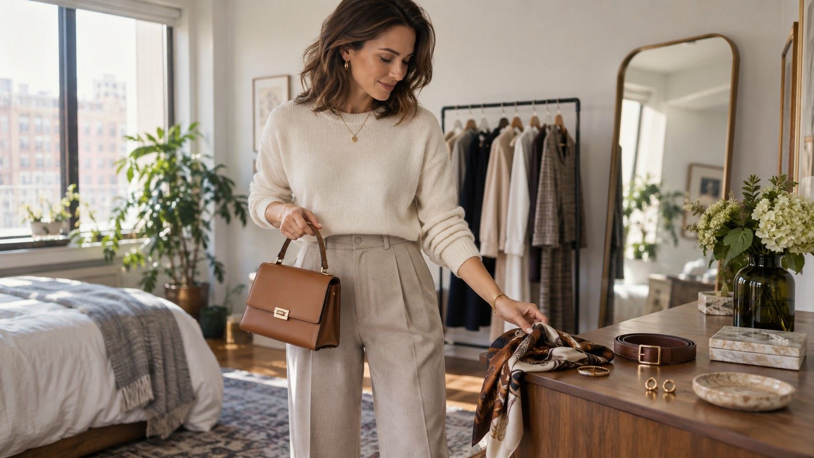
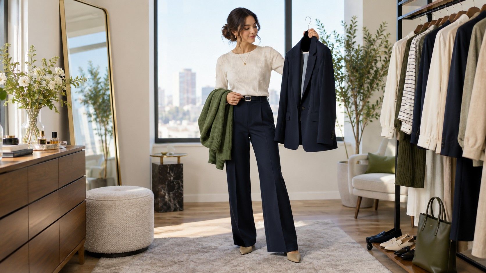
Start with a base pair you would wear even without an accessory. Navy trousers and a soft white shirt, olive chinos and a blue Oxford, black jeans and a berry knit: these are complete enough to leave the house in. Once the base feels stable, add a third color only when it has a job. A red shoe may create energy; a tan belt may connect brown leather details; a pale green scarf may make a dark coat less severe.
Three-color outfits go wrong when every element has equal volume. A bright yellow jumper, saturated blue trousers, and vivid red trainers can work for someone who enjoys the effect, but the colors need deliberate proportions. For a simpler result, let one color take most of the space, one support it, and one appear in a small detail. The chart is useful here because it suggests families, while proportion decides whether the family can share a room.
| Outfit structure | Easy starting combination | What to check before leaving |
|---|---|---|
| Low contrast | Oatmeal knit, stone trousers, taupe shoes | Use texture so the layers do not merge. |
| Medium contrast | Denim, white shirt, cognac leather | Keep the leather tones close rather than exact. |
| High contrast | Black trousers, ivory top, dark shoe | Make sure the face is not the only light area. |
| One accent | Navy, gray, and a burgundy bag or shoe | Repeat the accent once only if the outfit needs it. |
Let neutrals give the color some breathing room
Neutrals are not merely a safe retreat after a color experiment. They set the temperature and weight of the whole outfit. White makes most colors feel cleaner; cream makes them softer; charcoal makes them quieter; navy makes them more traditional; camel adds warmth; black raises the contrast. A useful outfit color chart should help you notice this, rather than treating “neutral” as one beige blank.
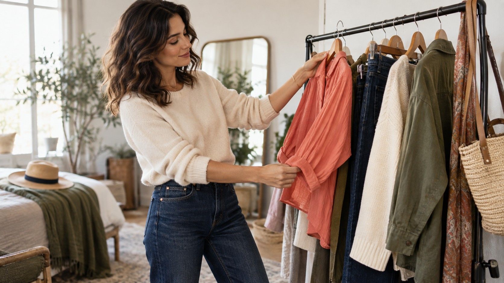
When a colored piece looks too eager, change the neutral before abandoning it. A bright green sweatshirt may feel sporty with black joggers but grown-up with dark indigo denim and chocolate boots. A dusty rose blouse that looks pale beside gray can look intentional with warm ivory. This small adjustment is more economical than buying another bright top every time an existing one lacks a partner.
Use saturation to avoid either a costume or a washed-out look
Saturation is the intensity of a color. Clear cobalt, tomato red, and grass green are high-saturation; slate blue, dusty rose, and moss are softened. Clothing charts often pair colors by hue and leave this out, which is why a technically correct combination can look noisy. Matching a muted olive with a muted rust is usually calmer than putting that olive beside a neon coral accent.
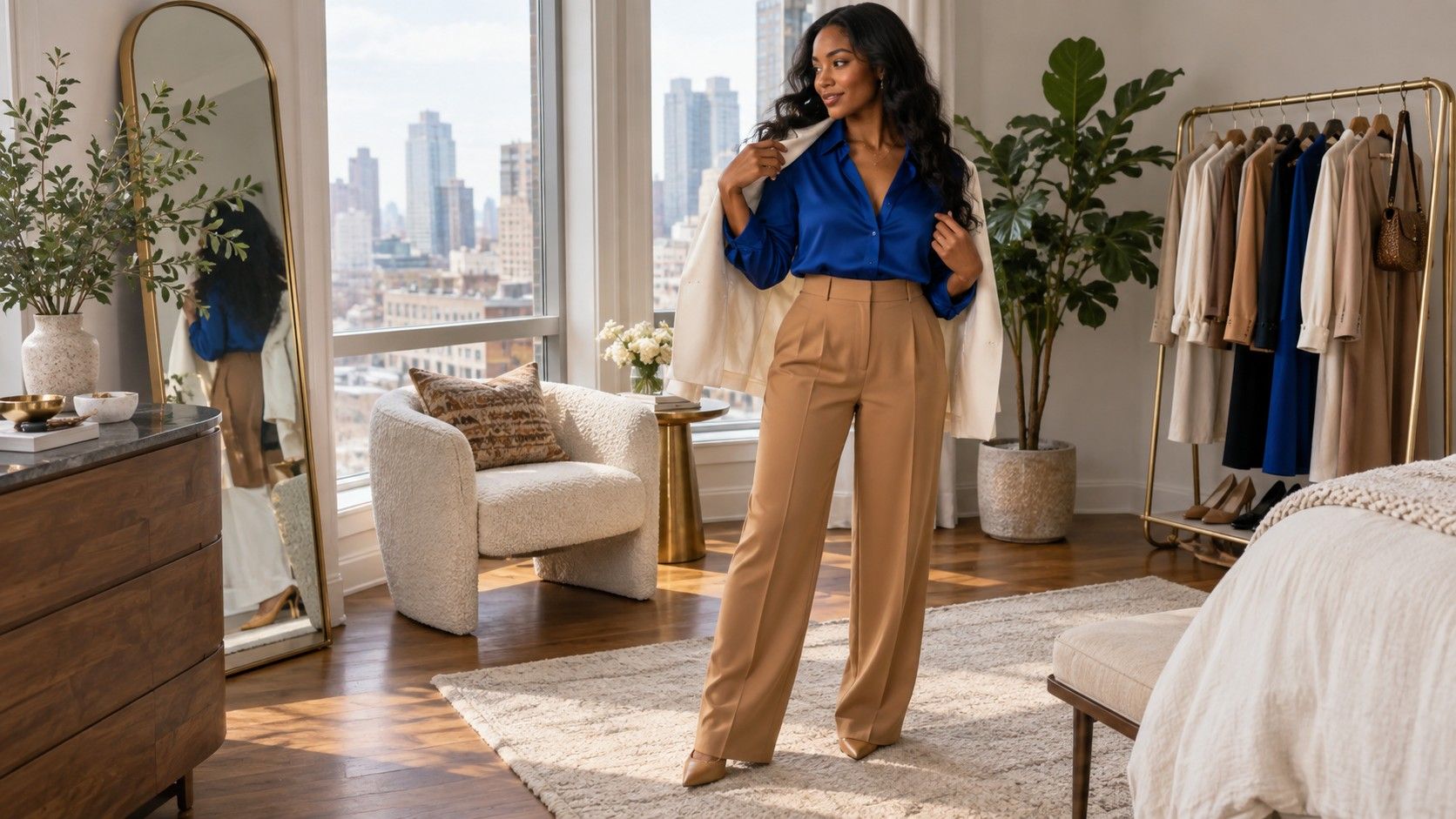
You do not need every item to be muted. One clearer piece can be the point of an outfit, especially near the face. The practical question is whether the surrounding pieces give it space. Pair a vivid blue jumper with mid-wash denim and gray trainers, for example, rather than adding a second bright accessory. If you want two saturated colors together, keep their values different or use a neutral break between them.
Check the combination where you will actually wear it
Before trusting a color guide for clothes, see the outfit in daylight, indoor light, and a quick photograph. A soft gray that looks elegant at home may disappear under fluorescent office lighting. A red scarf may be perfect outdoors and too loud once it is reflected in a restaurant mirror. These are not failures; they are normal changes in light and context.
Keep a small record of combinations that worked: not a rigid uniform, just three or four reliable formulas. You might learn that your best work outfit is navy, cream, and one warm leather detail, while weekends suit denim, faded green, and white. A color chart earns its place when it helps you repeat useful decisions with less second-guessing, not when it turns getting dressed into an art exam.